
By Catherine Austin Fitts
My “go to” website for technical analysis of precious metals, the US dollar & the US stock market is Rambus Chartology, where Rambus (that’s his handle – he’s the founding technical analyst) leads a discussion with extensive charts of what the markets are saying.
In January 2016, Rambus launched his quarterly Solari Report with a Blockbuster Chartology. You can find links to the entire series of quarterly and annual Blockbuster Chartologies at the end of this latest piece.
One of the reasons that Rambus is so good at his craft is that he focuses on “staying on the right side of the major trend.” The challenge of doing so at this time is that it is tempting to look for bottoms or to assume that the trend upwards in the US dollar or stock market may be over. However, Rambus consistently brings us back to the discipline of the Chartology. What does price tell us? As he describes so aptly, we are dealing with psychological warfare.
Sitting back once each quarter to get this perspective offers invaluable insight. So, here we go for the 3rd Quarter 2023 Wrap Up Blockbuster Chartology!
Blockbuster Chartology Quarterly Report
By Rambus
~ 3rd Quarter 2023 Wrap Up ~
PM Complex
US and World Stock Markets
Currencies
PM Complex
Last Wednesday, September 18th, Gold completed one of the most bullish chart patterns there is, a bullish expanding falling wedge. From a psychology perspective the reason this pattern is so bullish is because of the much lower low at the 4th reversal point. The last reversal point represents a capitulation of sorts cleaning out all the sell/stops before the price action reverses strongly to the upside.
This pattern is hard to spot early on because of the much lower low vs the previous low which feels like an impulse move to the downside. It is only when the price action reveres strongly to the upside that a case can be made that a bullish expanding falling wedge is in play. Note the large increase in volume last week.
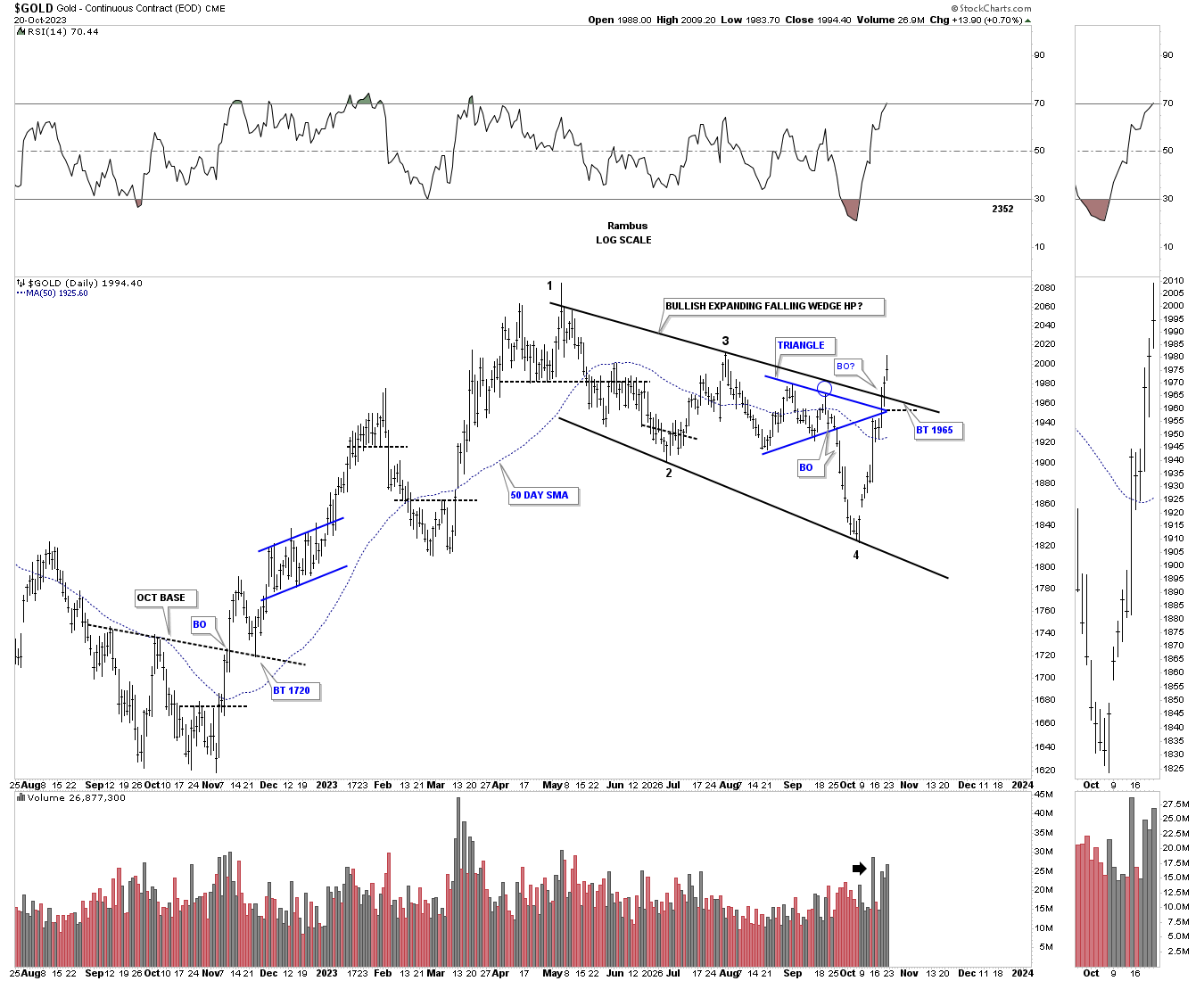
Looking at the shorter term daily chart above note the October 2022 low and the rally out of that important bottom which led to the formation of the bullish expanding falling wedge. To put that daily chart into perspective, below is a longer term weekly chart which shows the 2020 trading range and the large impulse move into the 2020 high which started at the right shoulder low of the 2016 H&S consolidation pattern.
The October 2022 low was also somewhat of a capitulation move as it undercut the 2021 low by a modest number of points. Up until the October 2022 low we were looking at a horizontal bottom trendline which was showing a nicely defined rectangle. So the October 2022 low, on the daily chart above, shows the entire rally into the high made earlier this year for Gold. From that high made earlier this year began the formation of the bullish expanding falling wedge which completed the breakout last Wednesday. Now we see if there is backtest for a low risk entry point.
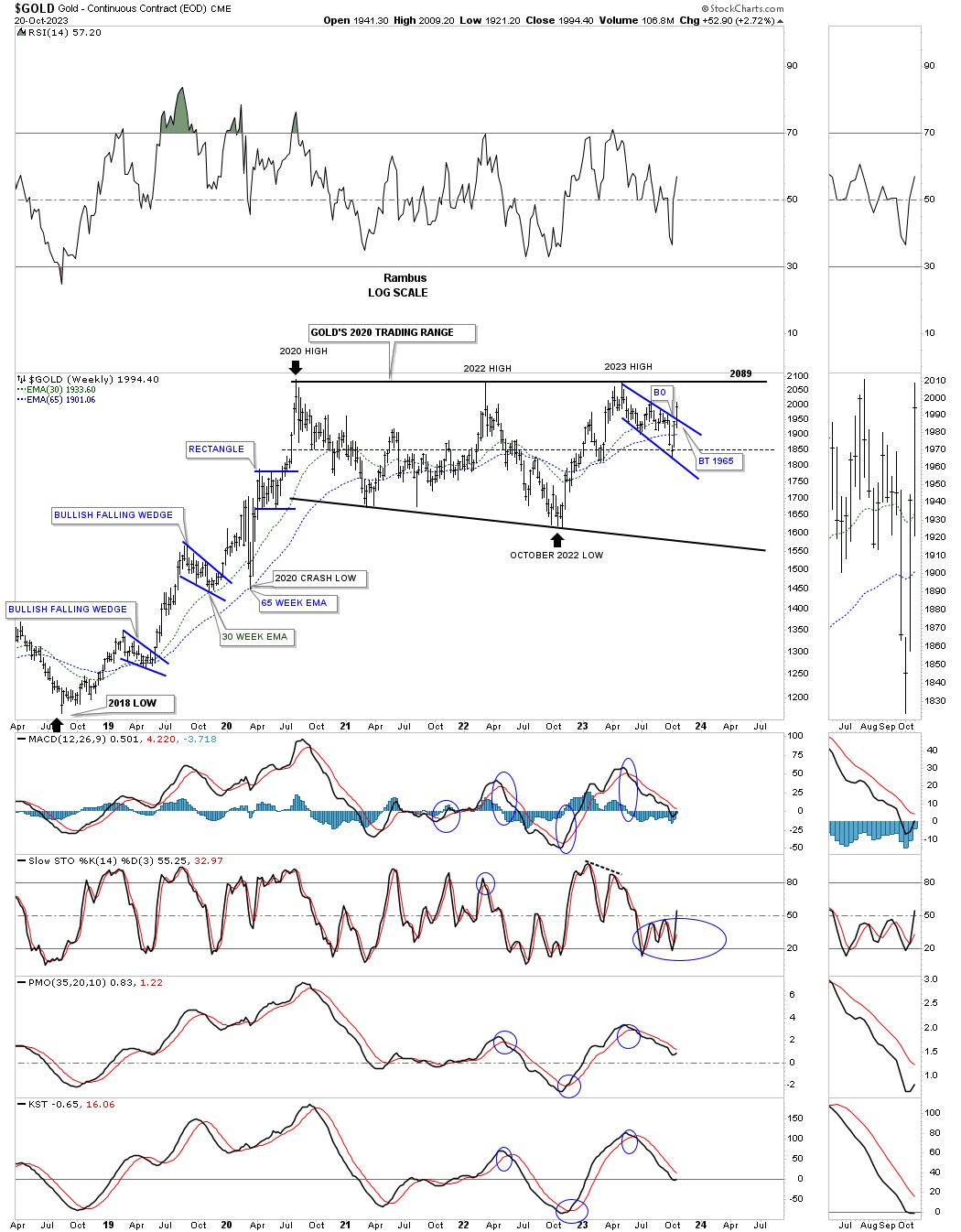
This long term monthly chart shows the 2016 H&S consolidation pattern and the impulse move that began at the right shoulder low made in 2018 which the weekly chart above shows. Last month Gold threw us a curveball as the price action closed below the 10 and 20 month ema which do an excellent job of holding support especially during a strong bull market. This month however Gold has rallied strongly and is now trading back over both of those two very important long term moving averages with seven trading days left for the month of October.
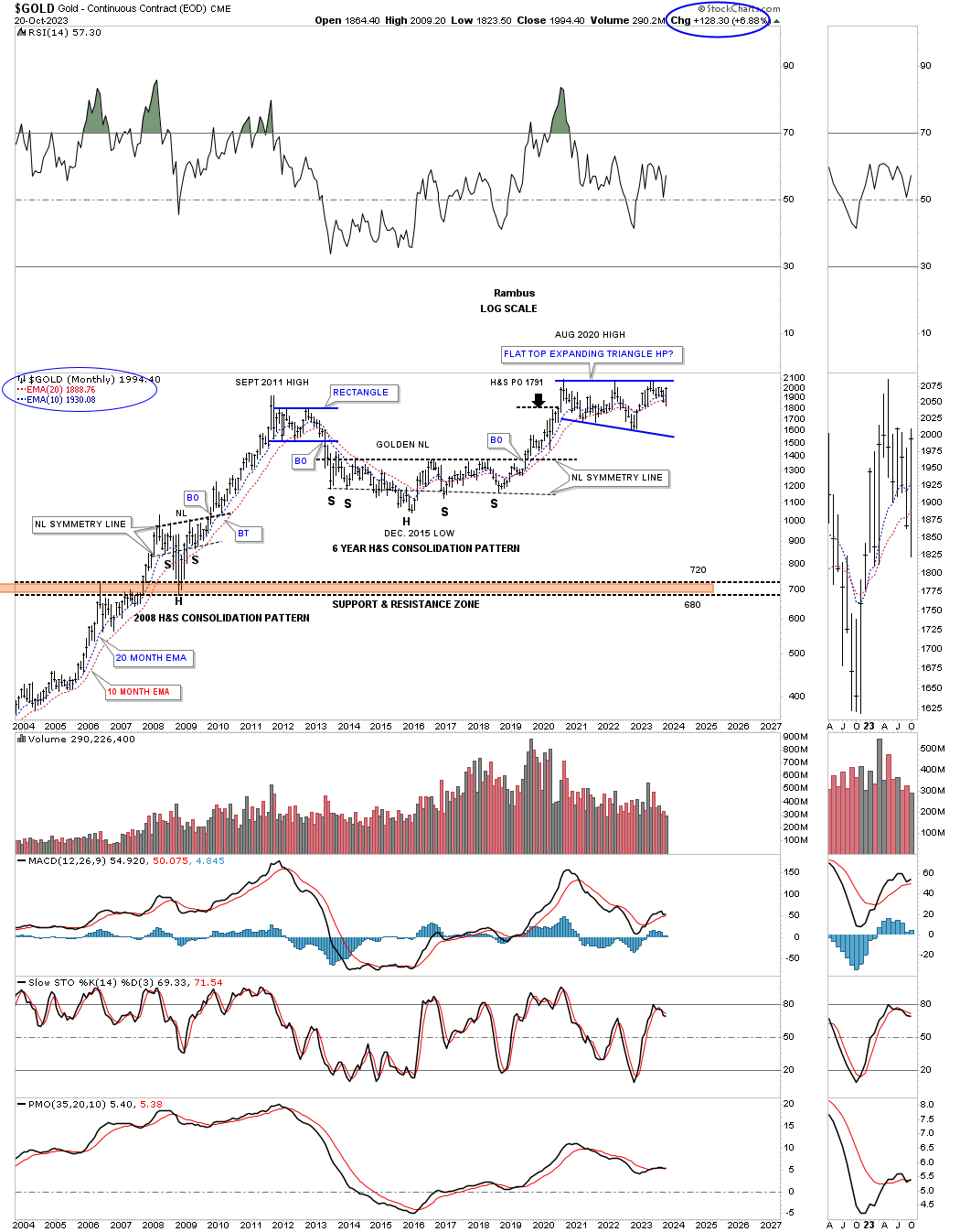
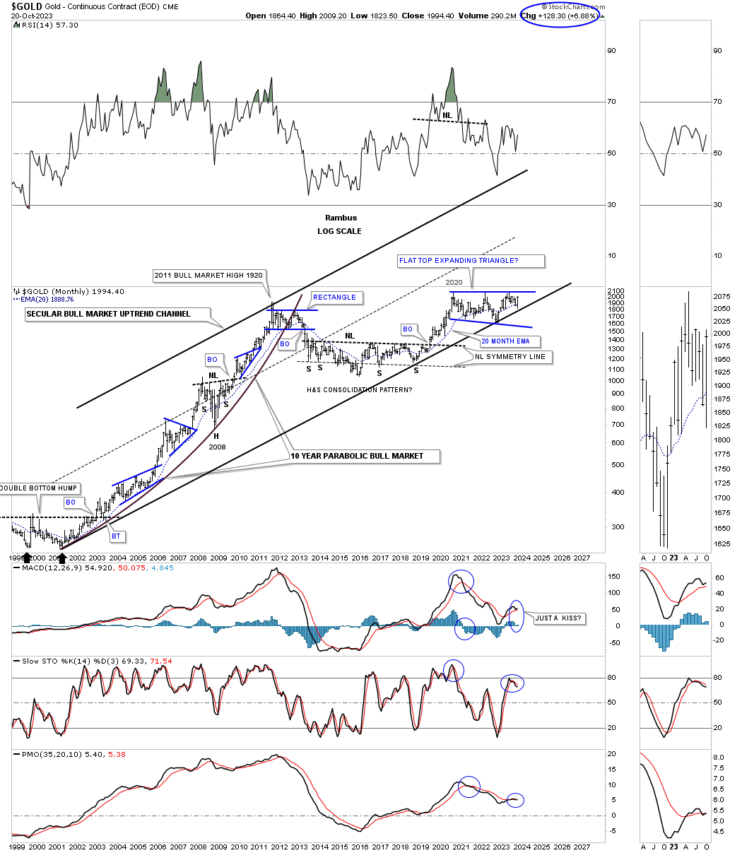
This next long term monthly chart shows Gold’s secular bull market that began in 2000 with the 2020 flat top expanding triangle. If you go back and look at the first daily chart for Gold you will see the October 2022 low also touched the bottom rail of the secular bull market uptrend channel while the low of the bullish expanding falling wedge fell just shy of a complete test of the bottom trendline of the 2000 secular bull market uptrend channel.
Below is the 25 year quarterly line chart showing Gold testing new all time highs from the quarterly line chart perspective. What really matters is where Gold closes at the end of the 4th quarter which is still over 2 months away.
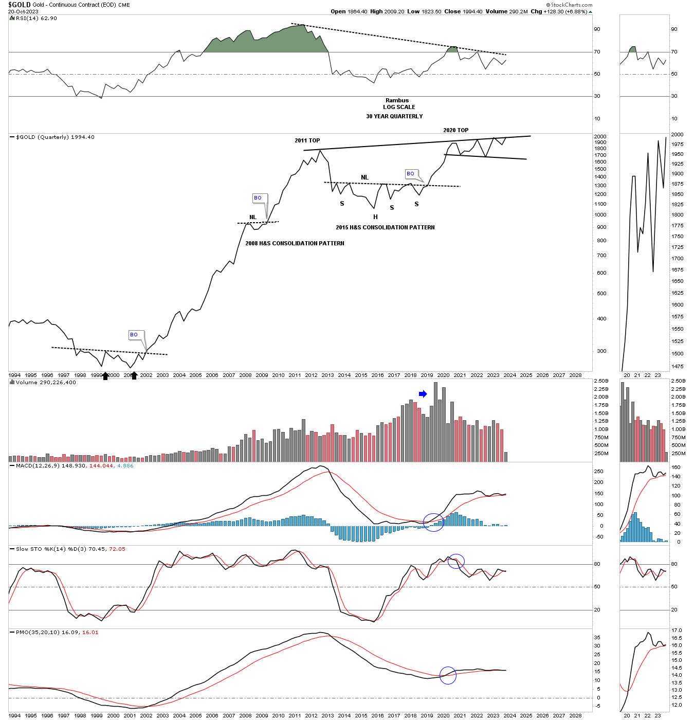
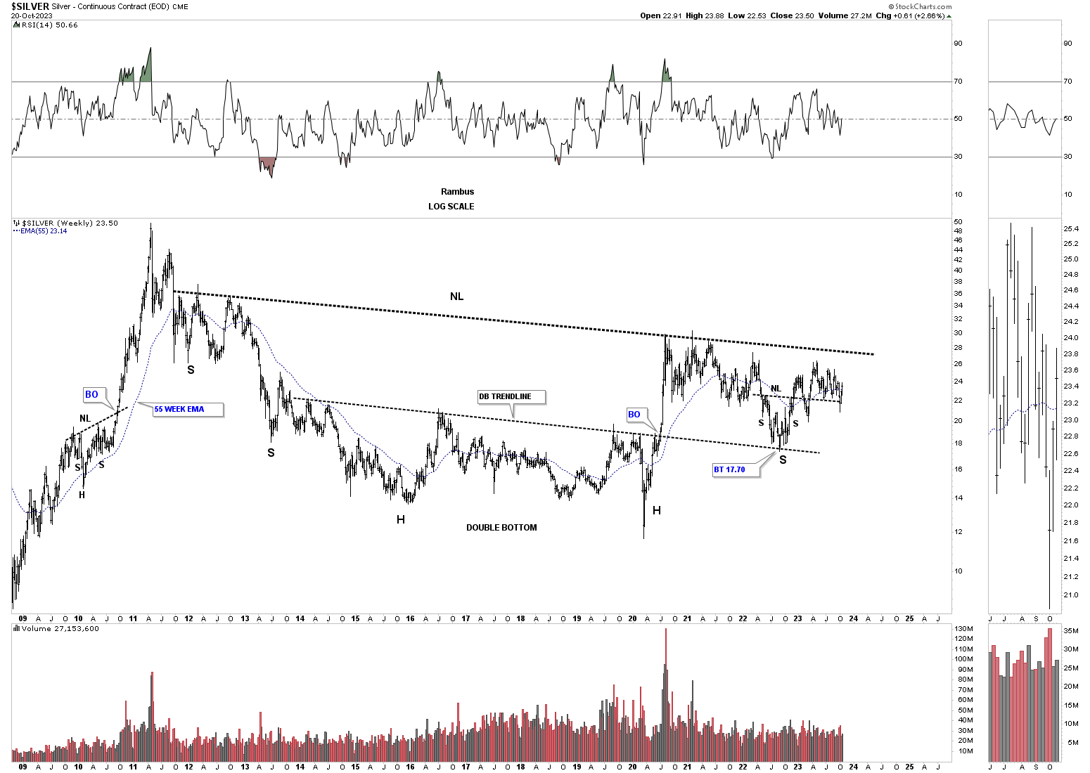
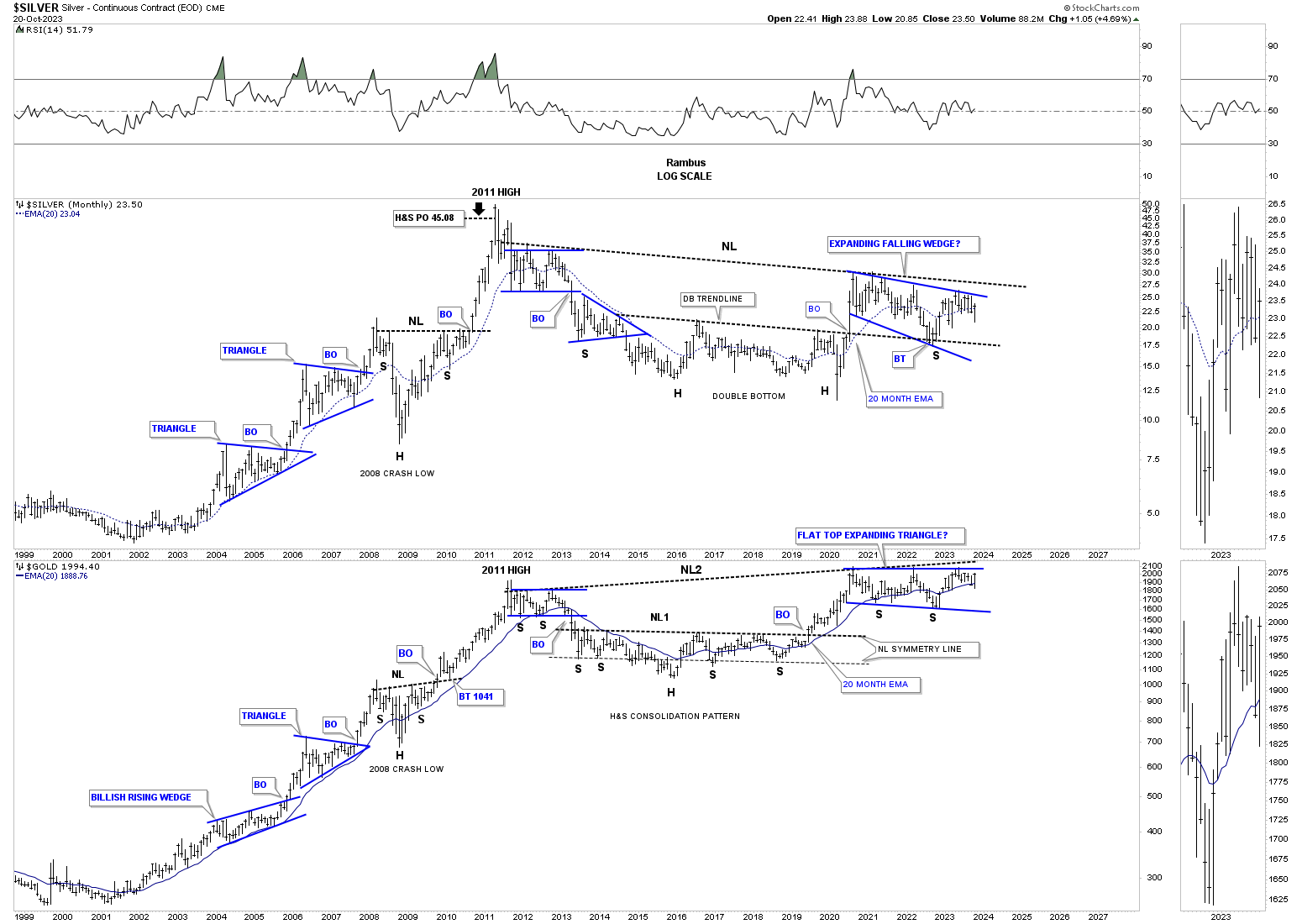
Lets move on to Silver from the long term perspective which is showing a massive, pretty symmetrical double headed H&S base. Note the multi year double bottom which formed the head and the double bottom trendline which held support on the backtest earlier this year which shows the possible right shoulder low. Even though the left and right shoulders are a little unbalanced the double bottom trendline and the neckline are the same angle for what it’s worth.
This next chart is a combo chart which has Silver on top with Gold on the bottom. I initially began showing these potential massive H&S consolidation patterns well over a year or so ago when the right shoulders began to form. Here again you can see the right shoulder low is the October 2022 low we looked at earlier, which shows up as a very important low in the much bigger picture from more than one angle.
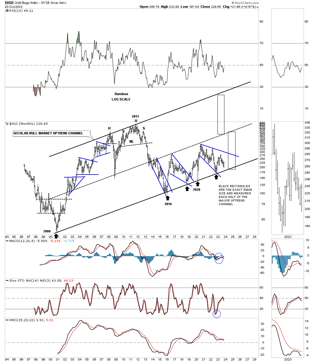
Next is a long term monthly chart for the HUI which shows the price action since the bear market low made in 2000 with the blue consolidation patterns that formed the bull market until the 2011 H&S top ended the bull market. After the neckline gave way on the 2011 H&S top, began the bear market which most likely ended in 2016. Since the 2016 low the HUI has been slowly chopping out a rising wedge with 4 completed reversal points.
Many times on the bottom rail of an uptrend channel you will see a double bottom form where the left bottom is slightly lower than the right bottom because of the upsloping bottom trendline. As you can see the HUI is getting a small bounce so far this month which could be setting up the double bottom and a low risk entry point using the bottom trendline as your line in the sand, above is bullish and below is bearish.
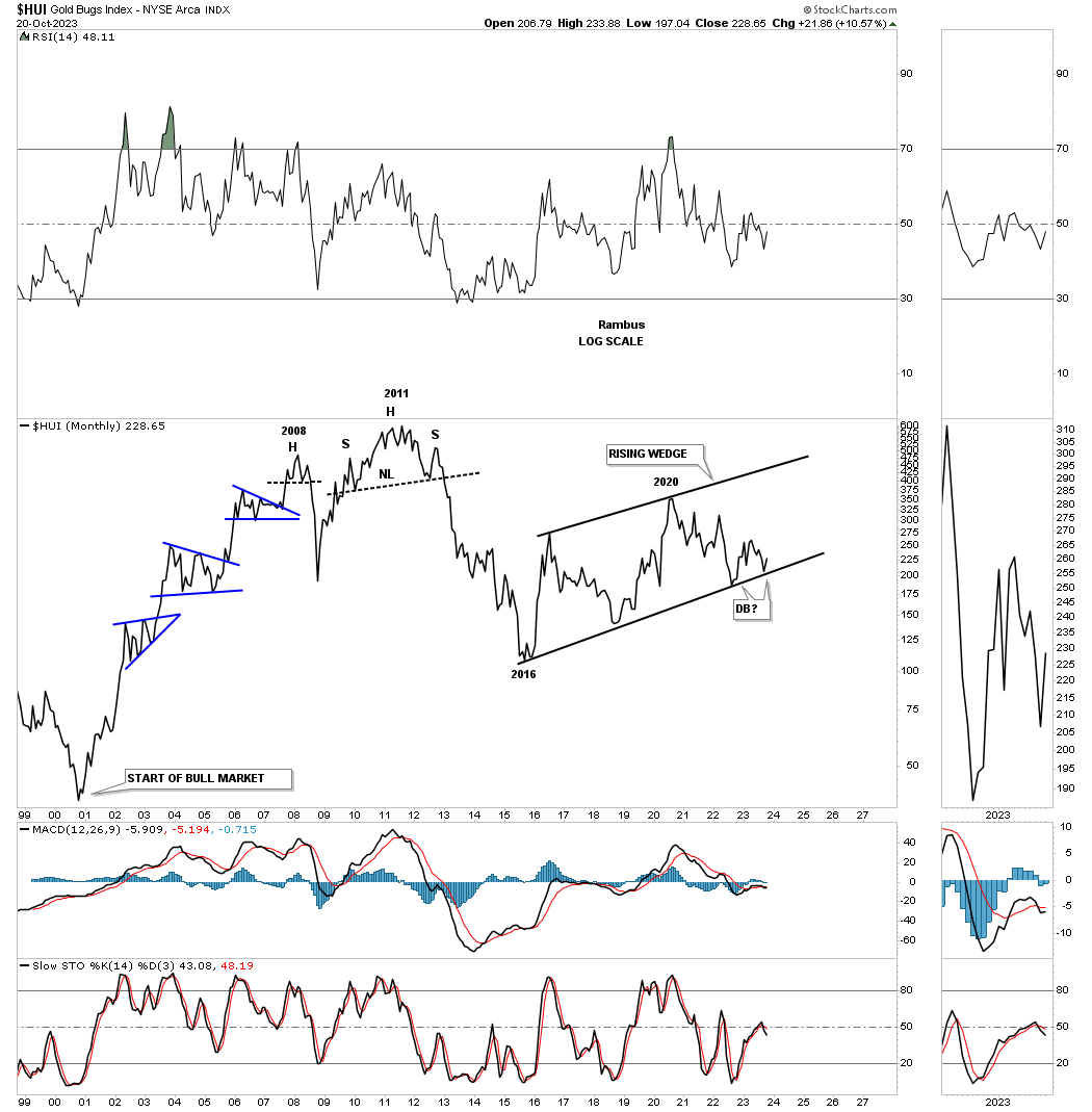
Then we have this history chart for the HUI which shows all the important chart patterns it has formed over its lifetime. Here again you can see the 2016 low which setup the bottom rail of the 2000 secular bull market uptrend channel and the three blue trading ranges that have formed just above the bottom trendline. Note how tight the lower channel is starting at the 2016 low. Many times when you see a nice tight channel like this it can double in size during a strong impulse move or in this case, bull market. The black rectangles are exactly the same height and measure each half of the 2000 secular bull market uptrend channel.
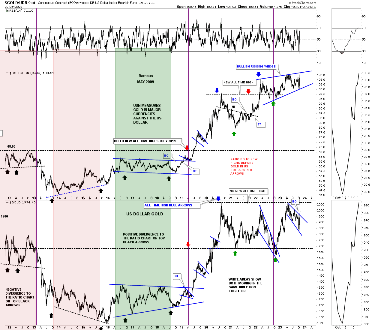
Lets move on to some ratio and ratio combo charts to see if they can give us any clues about what may lie ahead for the PM complex. Below is a ratio combo chart which has the Gold:UDN ratio on top with Gold on the bottom. The ratio chart on top measure Gold in most of the important currencies of the world and often leads Gold in US dollars on the bottom. A week or two ago when we looked at this chart the Gold:UDN ratio on top still had a ways to go before reaching the top rail of its possible bullish rising wedge. On a daily closing basis it closed at a new all time high this past Friday.
Gold on the other hand still has a bit further to go, but as you can see last weeks price action broke out from the blue expanding falling wedge we looked at on the daily chart above for Gold.
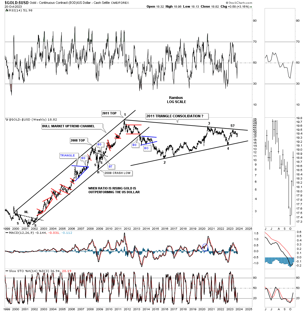
Next is Gold:US dollar ratio chart which shows its massive 2011 triangle trading range which has completed the minimum number of 4 reversal points putting it in the consolidation pattern category. We still have to see the breakout above the top trendline to confirm the triangle.
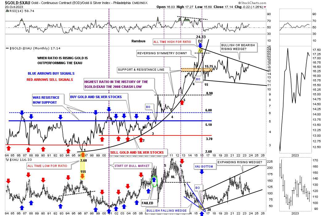
Next is the ratio combo chart which has the Gold:XAU ratio on top with the XAU on the bottom. Before and during the bull market years the blue arrows showed where a good low risk entry point would be to buy the PM stocks and the red arrows showed where to take profits. That all changed dramatically after the 2011 all time high in the ratio and all time high in the XAU when the the ratio broke above the blue horizontal dashed line.
There was no way to know back then how Gold would massively outperform the XAU/PM stock, but after the backtest to the blue horizontal line Gold went on a rampage vs the XAU forming a parabolic arc into the all time high made in 2016. As the ratio was making its all time high in 2016 the XAU was making its bear market low as shown on the lower chart. Fortunately we were able to see that small double top in 2016 which gave us a heads up to get positioned in the PM stocks.
Since the 2016 all time high in the ratio the price action declined straight down setting up the first reversal point in the now 2016 trading range. As you can see the XAU below has also created its own 2016 trading range with each one now trading at critical resistance for the ratio and support for the XAU. To say they are both at a critical juncture is an understatement as each has completed four reversal points.
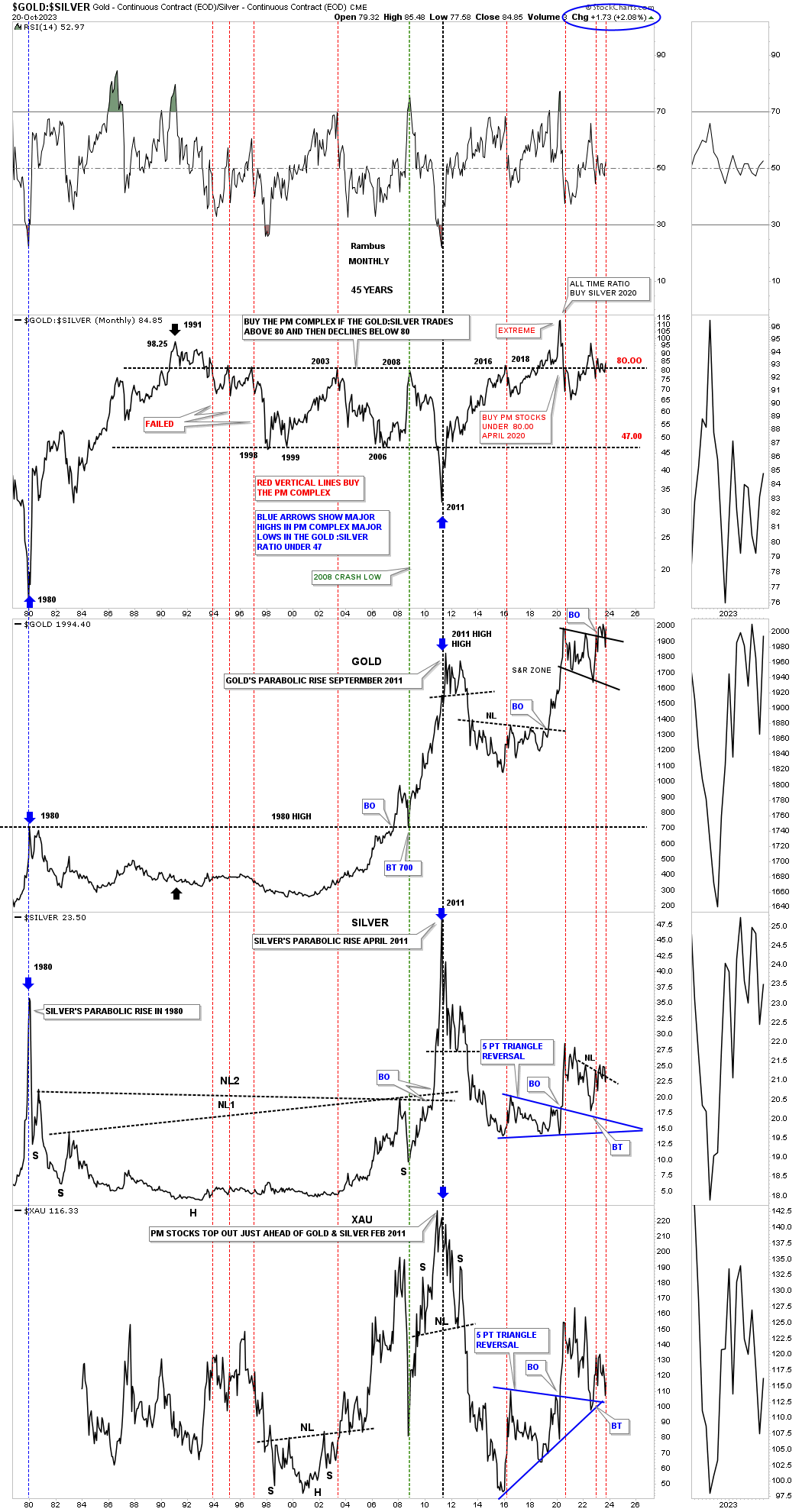
Everyone has their own way they like to look at the Gold:Silver ratio. For me I like to keep it simple. When the ratio on top is trading above 80 that is somewhat negative for the PM complex. When the ratio drops strongly to the downside is when the PM complex enjoys their best rallies, see indexes below the ratio chart, and the rally into the 2011 all time high.
I would like to finish up by looking at some ratio charts comparing Gold to the SPX.
This is what I wrote in my closing remarks last Friday.
There was definitely a divergence this week between the US stock markets and the PM complex. The next few weeks should let us know if the divergence between the two is authentic or not. If the PM complex keeps rising and the stock markets keep falling that could mark the beginning of a very long term divergence that can last for years. I’ll have more in the Weekend Report.
Today:
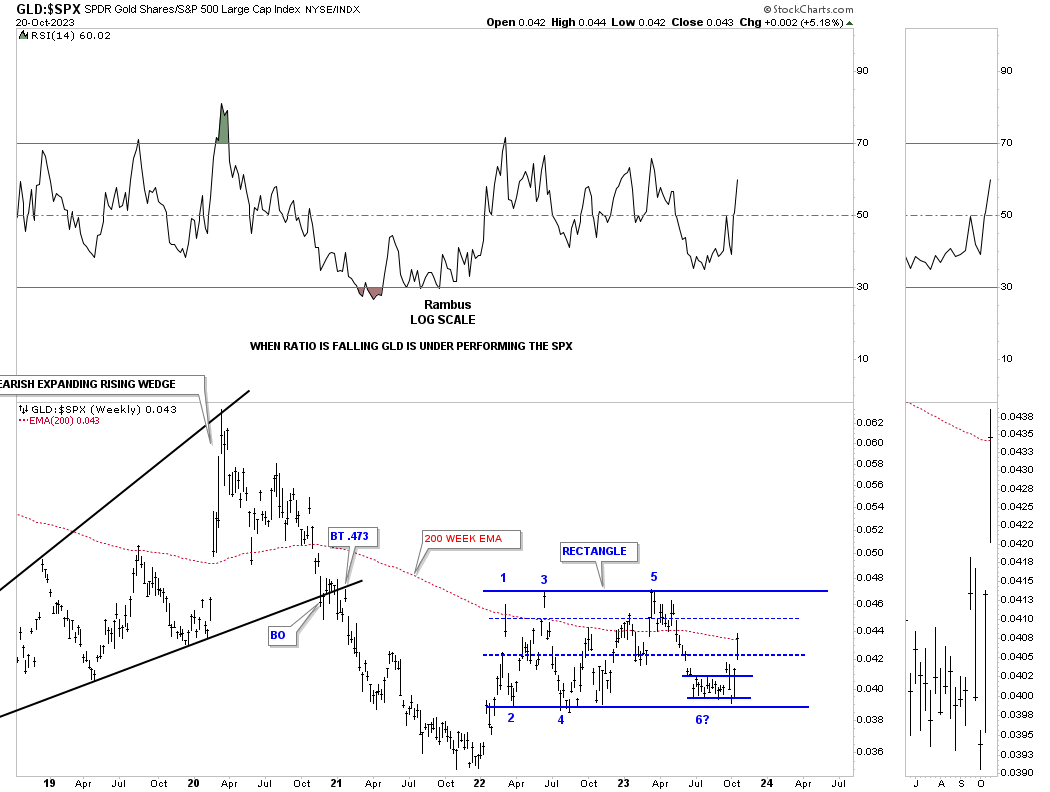
Lets start with this fairly short term weekly chart which compares GLD:SPX. After a nearly 2 year hard decline beginning at the 2000 high for the ratio, the ratio finally bottomed out in 2022 with a relief rally. Since that initial high a few months later the ratio has been chopping sideways going nowhere fast completing a multi point rectangle trading range.
Since the summer of this year the ratio formed another smaller rectangle at the potential 6th reversal point with a strong breakout last week, see gap over the center dashed midline.
Lets move out further in time and look at the Gold:SPX ratio and how the long term trend can last for many years. When the ratio is falling that means Gold is underperforming the SPX and vice versa. Normally the 200 week moving average is your line in the sand, above is bullish for Gold and below is bearish for Gold vs the SPX. Note the small shakeout below the lower black dashed S&R line at the 2022 low which formed the blue 5 point triangle reversal pattern that was able to give the ratio the energy to move back above the S&R line showing a higher low. Since getting back above the S&R line the ratio has been forming the blue rectangle we just looked at on the chart above. Last Friday the ratio closed the week just above the 200 week moving average which is the first sign of potential strength where Gold could start outperforming the SPX.
The ratio is still very low and there is still a lot of work to do, but as long as that horizontal black dashed line can hold support that is a good sign that Gold is holding its own against the SPX.
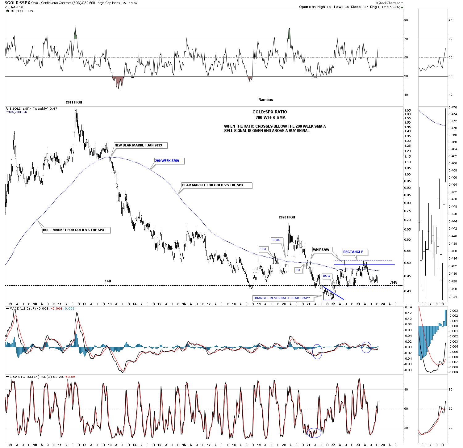
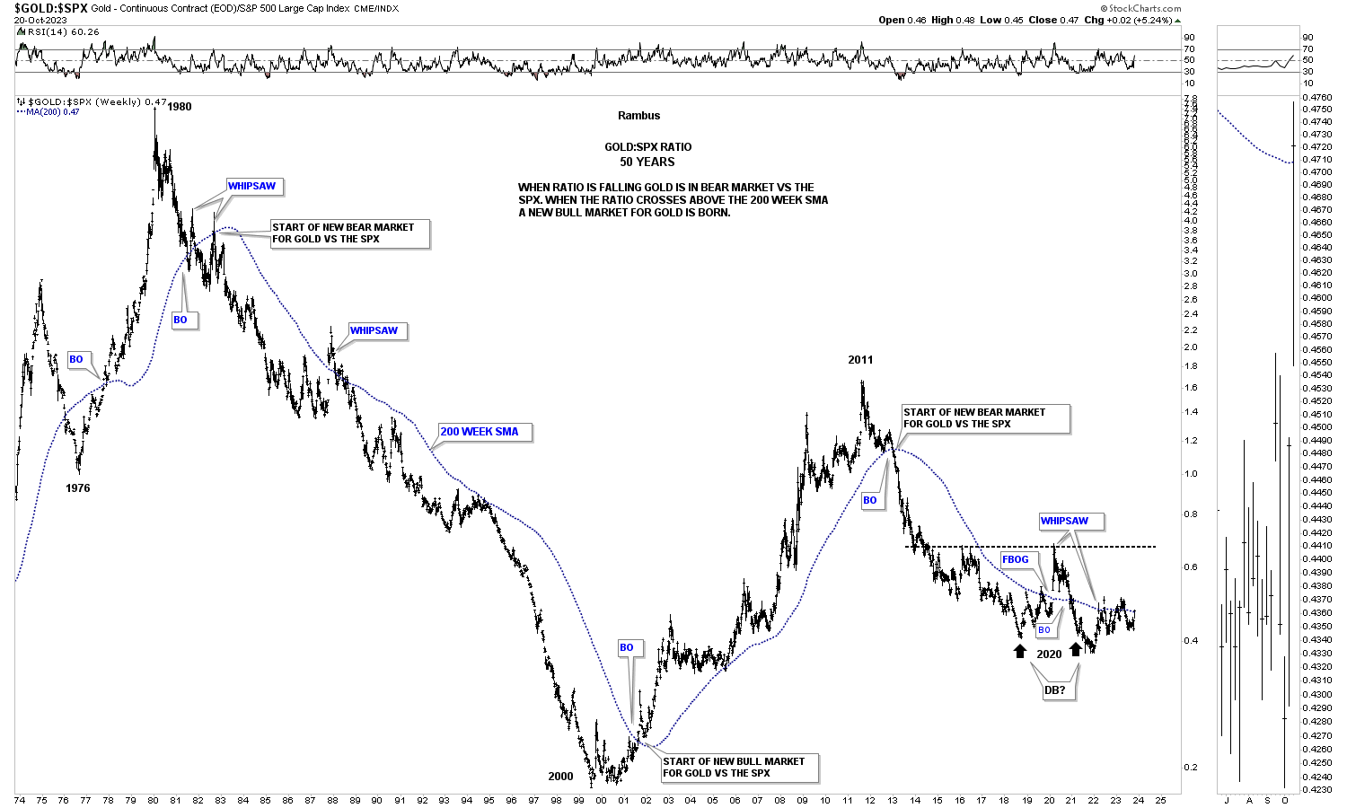
Moving out to the very long term monthly chart for the Gold:SPX ratio, you can see that massive decline that began at the 1980 all time high for Gold back then underperforming the SPX for 20 years until the ratio bottom in 2000 where Gold finally outperformed the SPX into the 2011 high. Since that 2011 high Gold has underperformed the SPX in no uncertain terms. Again, you can see how well the 200 week moving average keeps you on the right side of the equation.
A possible bullish scenario for Gold vs the SPX would be to see a double bottom reversal pattern form at the current low which could setup an extended move where Gold outperforms the SPX for years Into the future as it has done in the past.
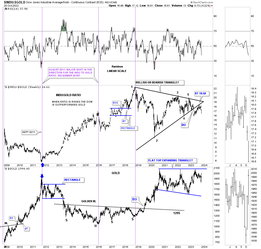
This last chart for tonight is a ratio combo chart that compares the INDU:GOLD on top with Gold on the bottom which I’ve been following for many years. When the ratio chart on top made its high in 2018 Gold on the bottom was just starting its strong impulse move out of the right shoulder low we looked at earlier. When Gold finally put in its 2020 high the ratio began to decline putting in its 2nd reversal point. Since then both have been moving sideways. What is very interesting with the INDU:Gold ratio is that it has formed five clean reversal points with a breakout gap below the bottom trendline and a backtest several weeks ago. In the meantime Gold just completed its bullish expanding falling wedge with a breakout to the upside last week.
Until Gold breaks out from its 2020 flat top expanding falling wedge there is still a bit of doubt that Gold is truly beginning its next major bull market upleg, but there are many signs that the next move higher into new all time highs has the best chance of succeeding than at anytime in the past three years.
Keep in mind Gold is still in its 2020 trading range and hasn’t even broken out yet. The last major leg up out of the right shoulder low in 2018 lasted two years so there is a lot of time to get positioned in you favorite PM stocks. All the best…Rambus
US Stock Markets
Normally I like to start with the long term charts and work my way back to the shorter term charts to get a feeling of where a stock or market is currently trading relative to its past. Tonight I’m going to start with the six month 2 hour charts and bring into focus the potential H&S tops we’ve been following. These potential H&S tops could very well be offering us a really good low risk trade that hasn’t been easy to find since the summer months.
When looking at these two hour charts to follow keep in mind a stock does only three things. First, it’s either building out a consolidation pattern, second, a reversal pattern and third is in an impulse move between a consolidation or reversal pattern. The key is understanding which one of the three scenarios a stock is in.
In regards to a H&S top, at some point during the rally phase, there is usually a consolidation pattern that forms and leads to the next trading range. Once the impulse move exhausts itself either a consolidation or reversal pattern begins to take shape as the price action trades sideways, usually not giving a good clue until the trading range becomes more mature.
Many times during the formation of a H&S top the head portion will either be a smaller double top or H&S top which is the very first clue that a reversal pattern may be in the cards. The first decline from the double top or small H&S top, the price action will trade below the previous consolidation pattern high made on the way up, which really starts to put the larger H&S top in perspective.
When looking for a place to add a possible neckline many times the area close to the previous consolidation pattern low will come into play as a starting point. Sometimes the neckline can slope up or down and sometimes it can be strongly slanted. Other times it can be unbalanced with two left shoulders and one right shoulder or vise versa. There can be many variations, but a H&S top will always have an odd number of reversal points with reversal point #1 being the left shoulder high with number #2 being the where the neckline starts. Number #3 is the head #4 the right shoulder low and number #5 being the right shoulder high.
This is what I wrote back on August 11th showing the potential beginnings of a possible H&S top.
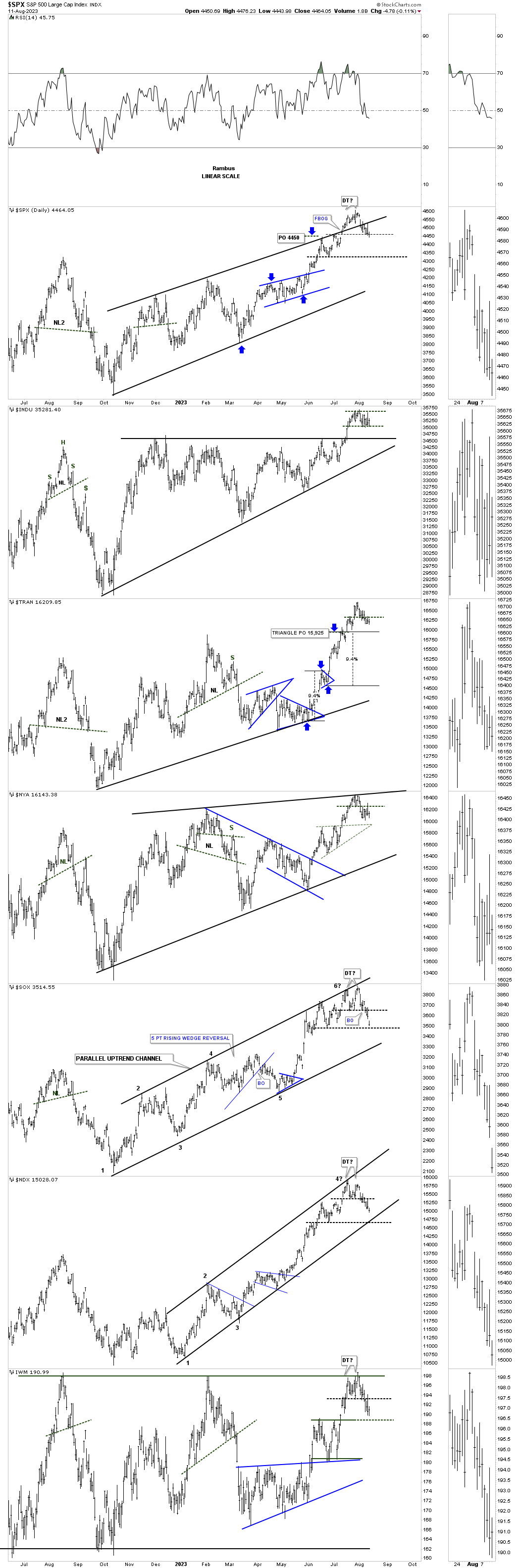
This last chart for today is the daily combo chart for the US stock markets.The indexes that were showing the most strength out of the October 2022 low, the NDX and SOX, are currently underperforming a bit. If we are going to see a deeper correction over the next couple of months we could see a H&S top start forming with the small double tops being the head. If that is going to be the case we will need to see the right shoulder start forming off the previous low, heavy horizontal black dashed trendline in most cases.
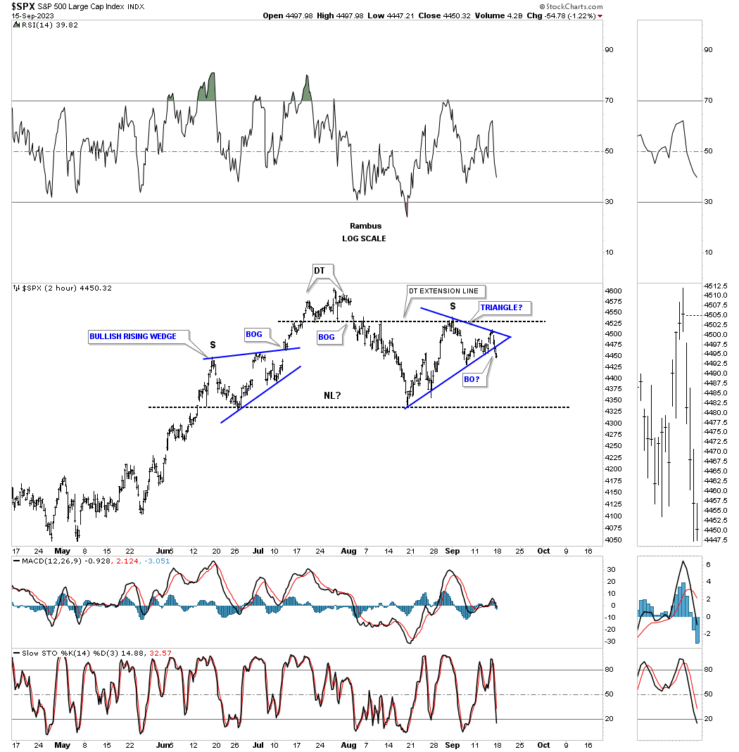
Today September 17th: As you can see on the chart above we were seeing the first phase of a possible H&S top as shown by the small double tops with the price action starting to break below the left shoulder high. As you can see on this 2 hour chart for the SPX the price action ended up finding the low close to the left shoulder low where I was able to add the neckline. We got the countertrend rally, which in this case for the SPX was a little strong, finally stalling out a bit higher than the left shoulder high, but at the double top extension line.
Many times a H&S top will show a small consolidation pattern for the left shoulder and a small consolidation pattern for the right shoulder. Last Friday the price action may have broken out from the right shoulder consolidation pattern to the downside. All the pieces of the puzzle are in place except for the very last one, a breakout below the neckline.
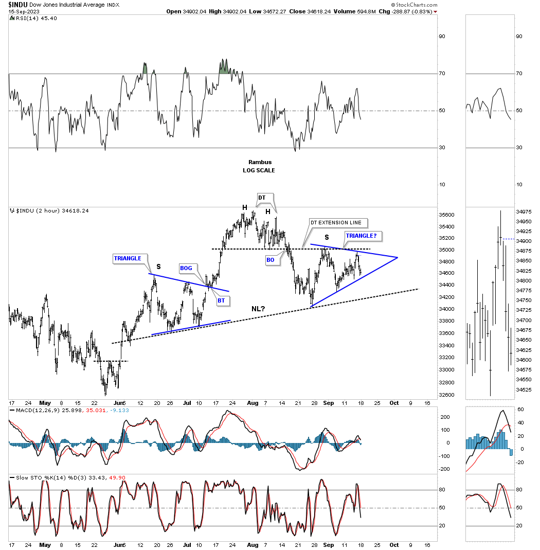
The INDU is a little more symmetrical with the left and right shoulders being a triangle.
On the daily combo chart we’ve been following on the, Markets Update, the Transportation Average was the first one to breakout below its neckline. This chart shows the smaller H&S #1 as the head. Even though the right shoulder is a bit larger than the left shoulder the neckline symmetry line showed us a place to look for a possible right shoulder high.
![]()
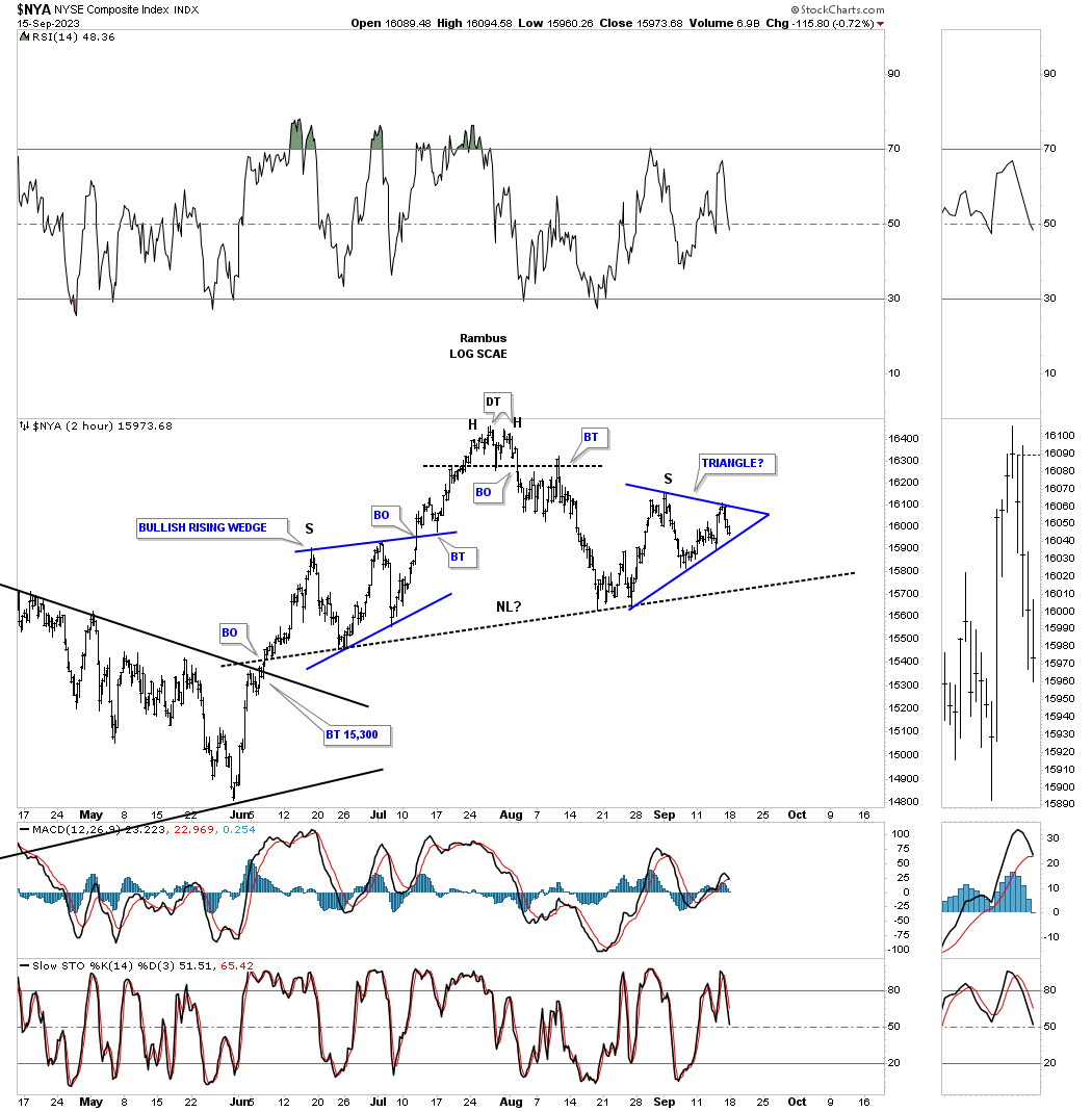
The two hour chart for the NYA which is a broad measure of stocks.
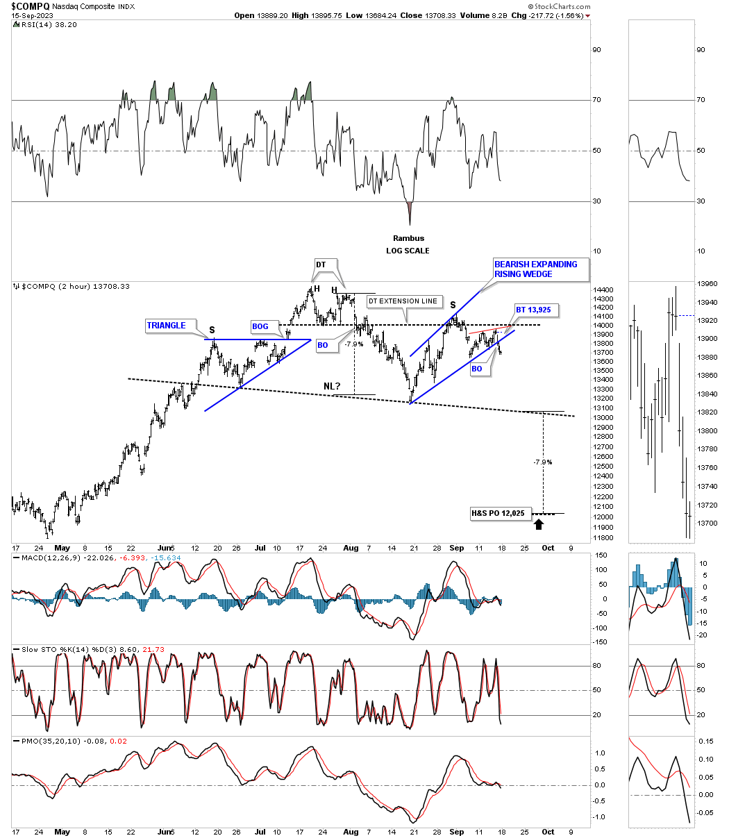
The COMPQ has been in the leadership role and has held up the best, but that leadership role could be coming to an end with the breakout below the bottom rail of the blue bearish expanding rising wedge right shoulder last Friday. You can also see the red bearish rising wedge which formed just above the bottom rail, also giving way at the same time.
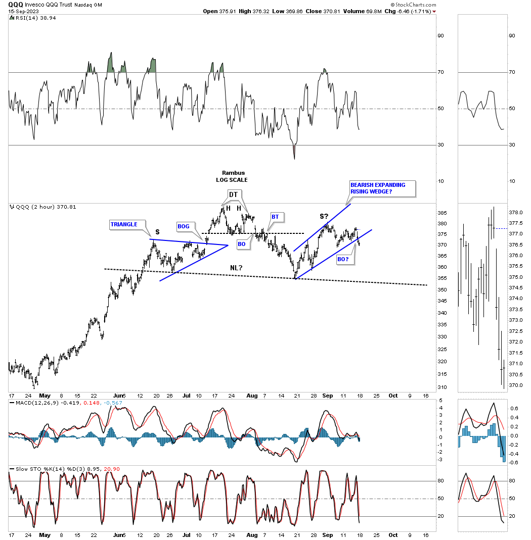
The QQQ two hour chart.
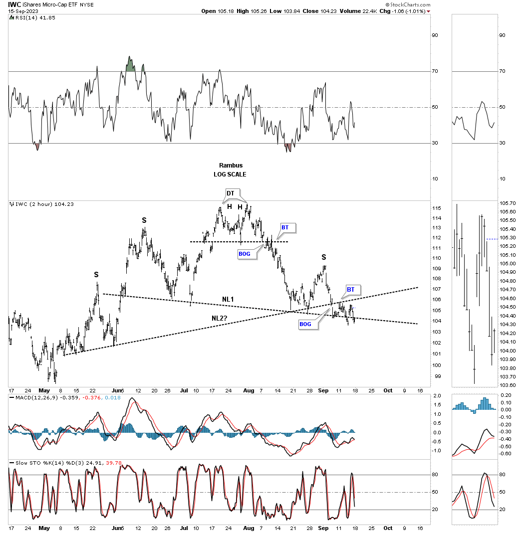
Next is the IWC, micro caps etf, which is forming a possible unbalanced H&S top with two left shoulders and two necklines.
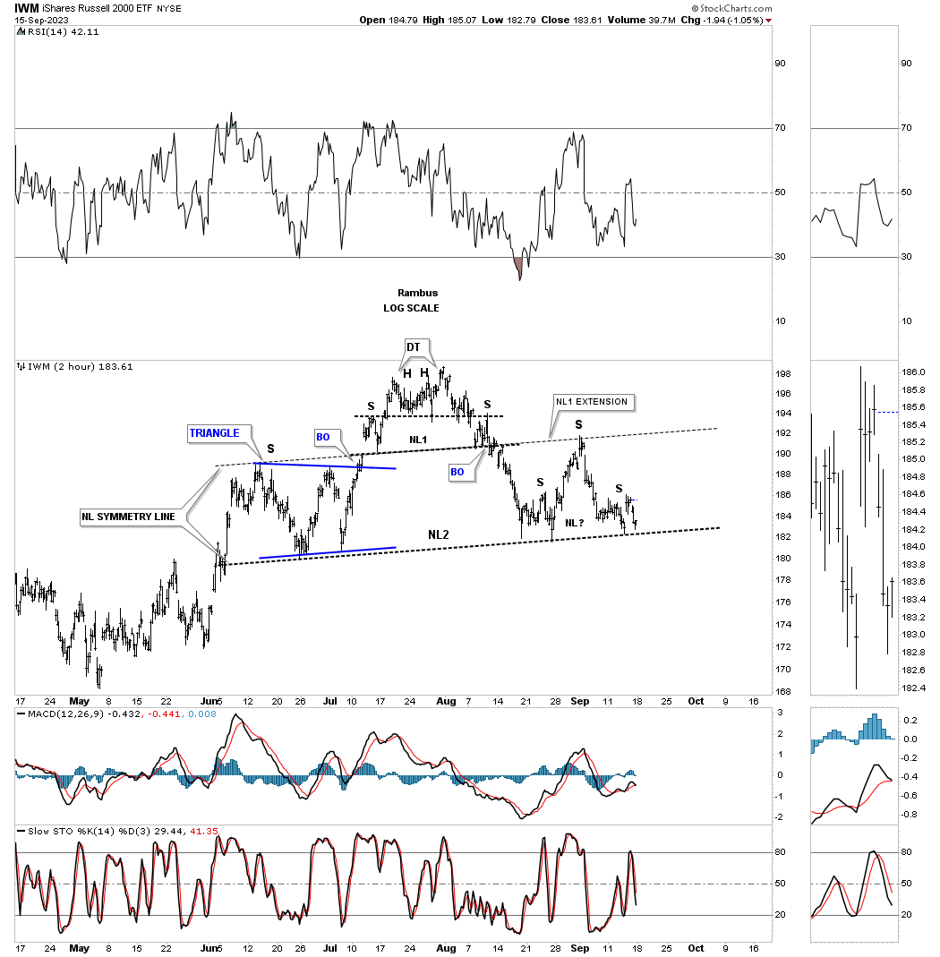
The IWM, small caps etf, forming a pretty symmetrical H&S top as shown by the neckline symmetry line with the possible right shoulder being a H&S consolidation pattern.
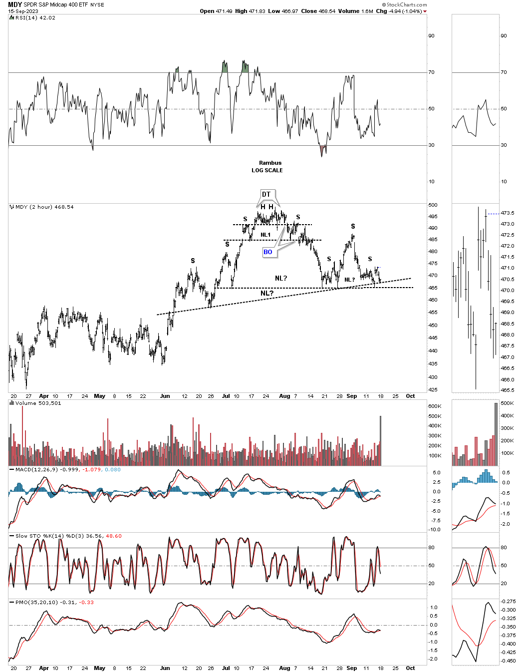
MDY mid caps forming a possible unbalanced double H&S top.
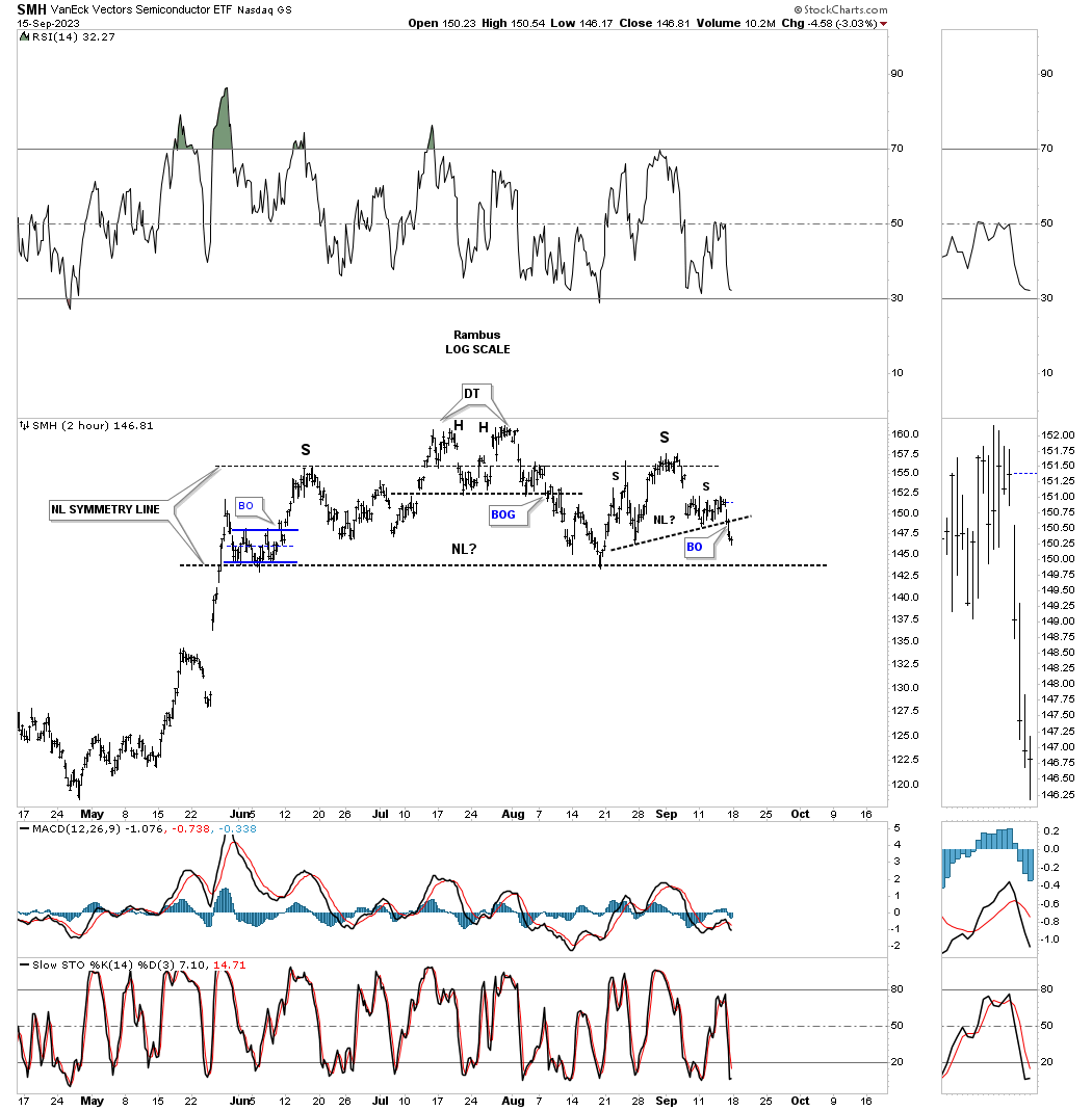
Lets look at several key areas in the markets. First is the 2 hour chart for the SMH, semiconductor etf, which is forming a pretty symmetrical H&S top as shown by the neckline symmetry line with the possible right shoulder H&S consolidation pattern.
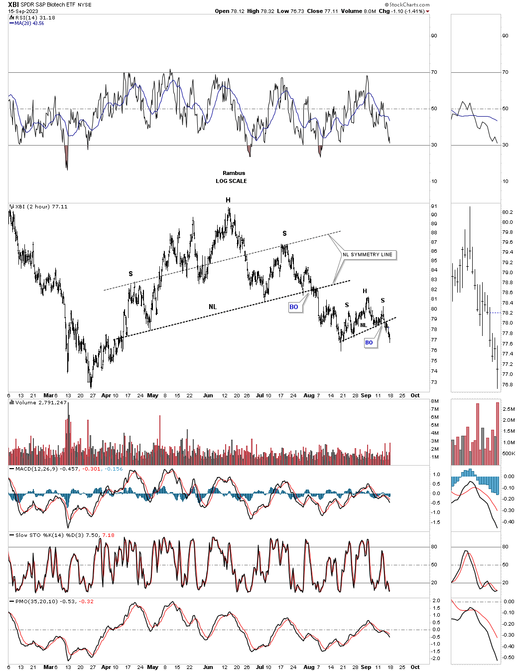
For the last couple of years the XBI, Biotechnology etf, has been one of the weakest areas in the stock markets. As you can see the XBI is further along than most of the areas above as it has already broken out from its H&S top and broke out from its H&S consolidation pattern last Friday.
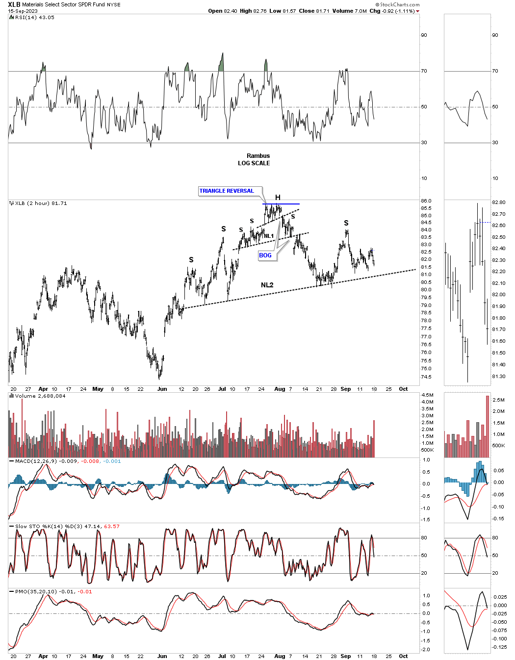
The XLB, Basic materials fund, is forming a possible unbalanced H&S top.
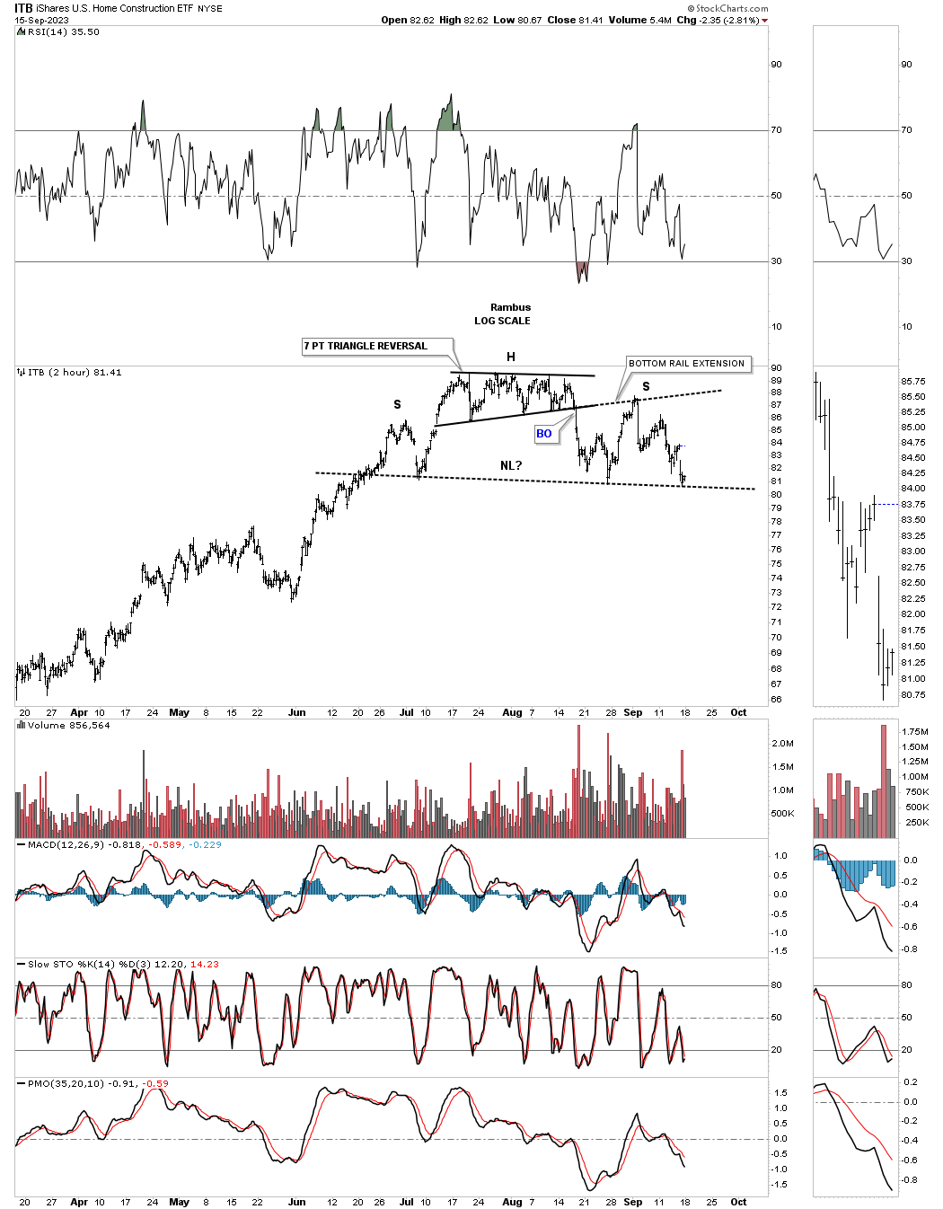
The ITB, US home construction etf, hit its neckline last Friday so the test is on for the possible H&S top to complete. Note the 7 point triangle reversal pattern that formed the head.
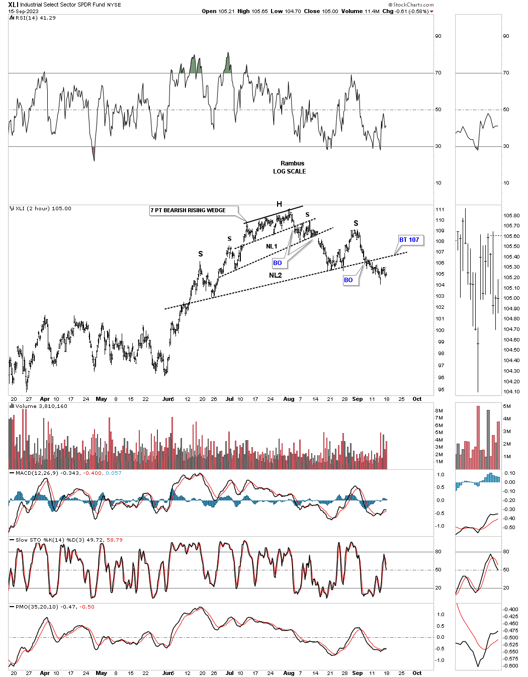
The XLI, Industrial fund, had been one of the strongest areas in the markets until its neckline gave way. It too has a double H&S top with a 7 point bearish rising wedge as its head.
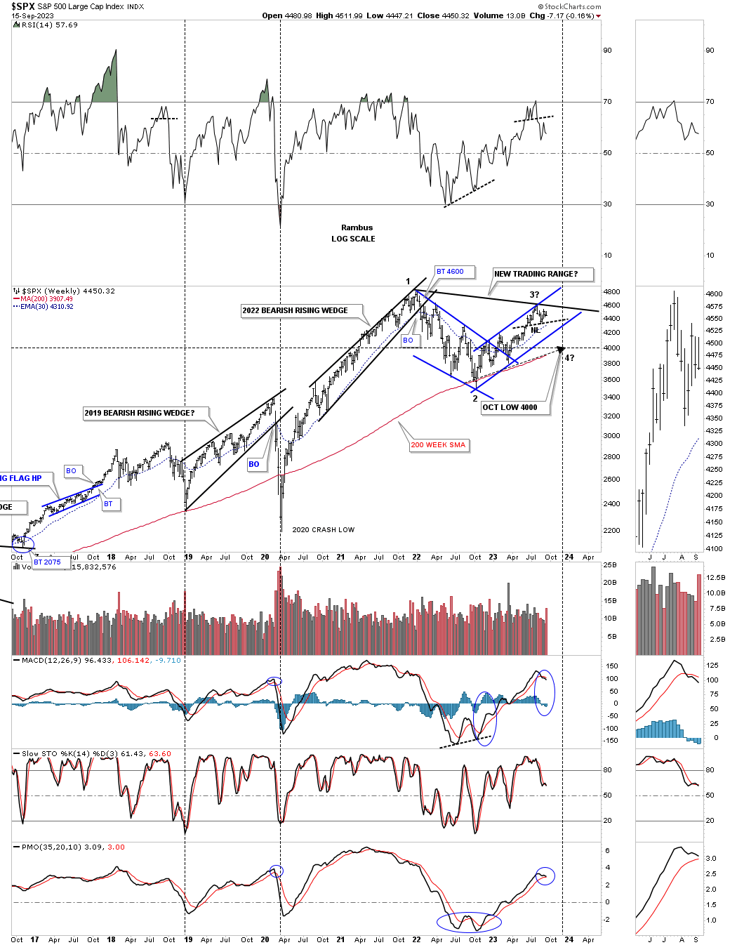
This next chart is the daily combo chart we’ve been following on a daily basis showing the rising wedges and channels off the October 2022 low and why these potential H&S tops are so important as a reversal pattern after a nearly one year rally phase.
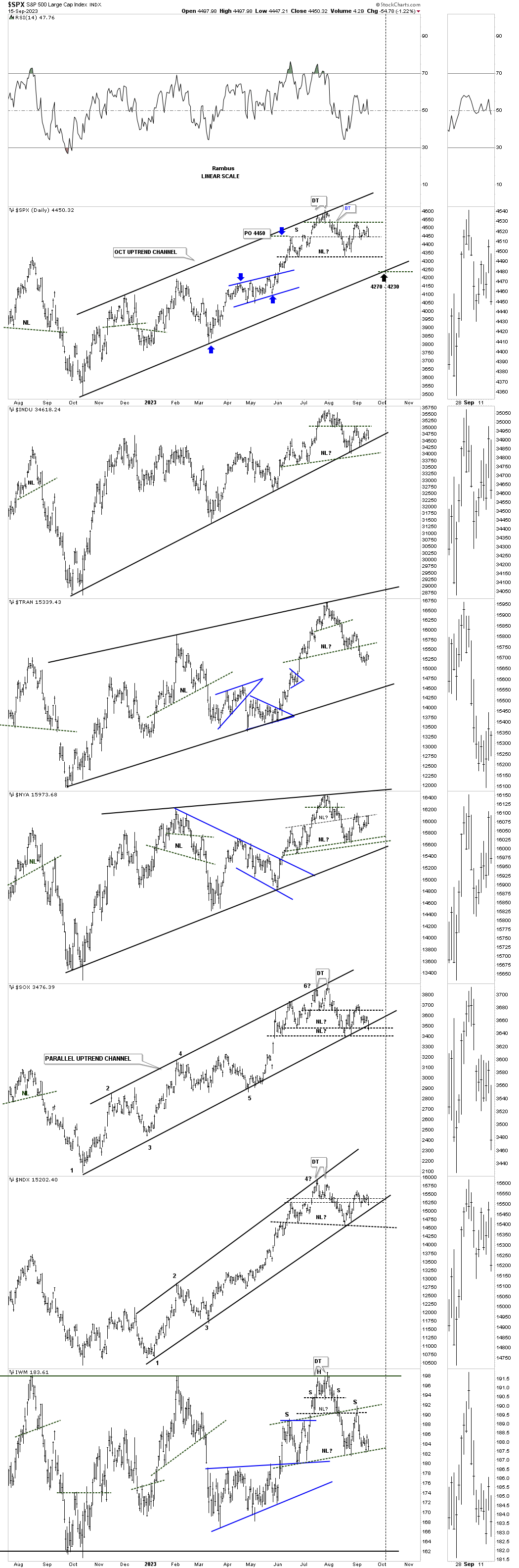
This last chart for tonight is the long term weekly look at the SPX we looked at about 8 weeks or so ago looking for a possible low, in October, around the 4000 area as shown by the 200 week sma. You can see how the small 2 hour H&S top on the SPX above is showing up at the possible 3rd reversal point in the much bigger, new trading range.
The main reason I’ve shown you the 2 hour charts tonight is that it is giving us a possible low risk entry point in which we can get a bit aggressive if the H&S tops keep playing out since we first observed their presence back in early August. As each neckline gives way that will offer up another low risk entry point along with the bottom rail of the October 2022 rising wedges and channels.
I’ve always said, I’m an equal opportunity trader. I don’t care if its is on the long side or short side as long as there is enough evidence to get the odds in my favor. This week I’ll be watching the 2 hour charts above for new entry points if they present themselves on the short side. Have a great weekend and all the best…Rambus
Currencies
Part 1 the US Dollar:
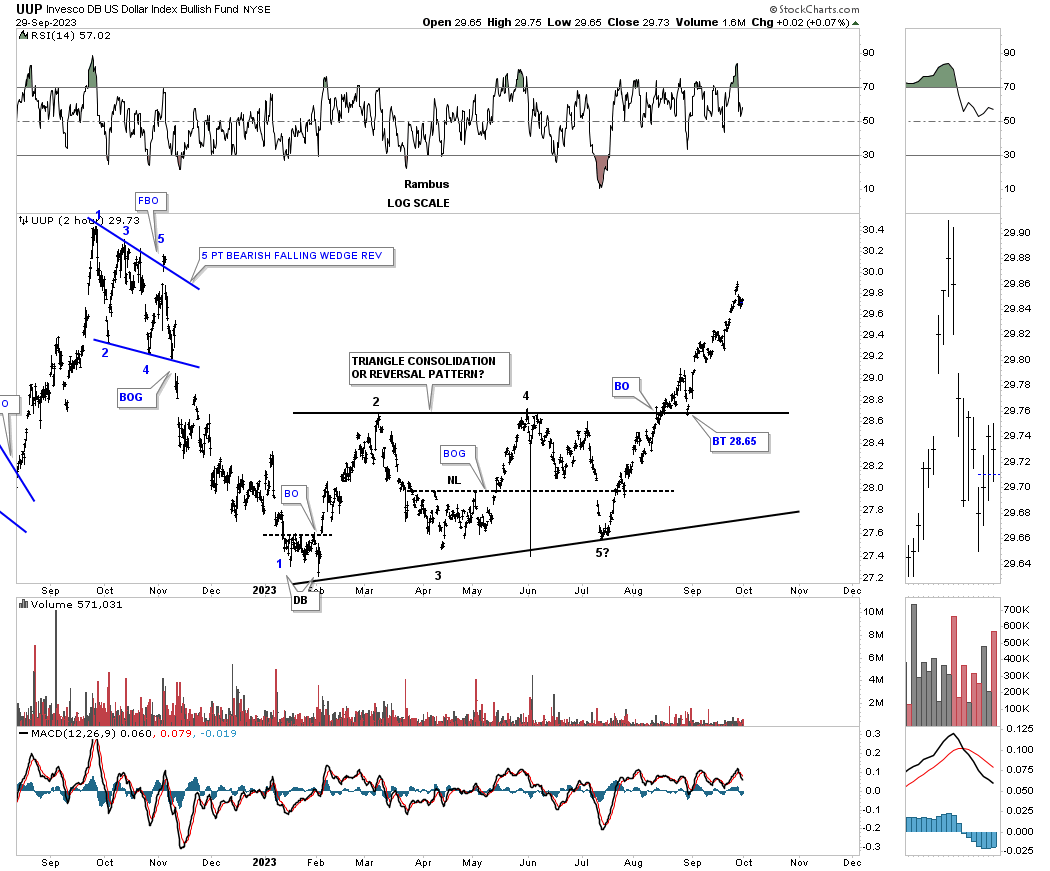
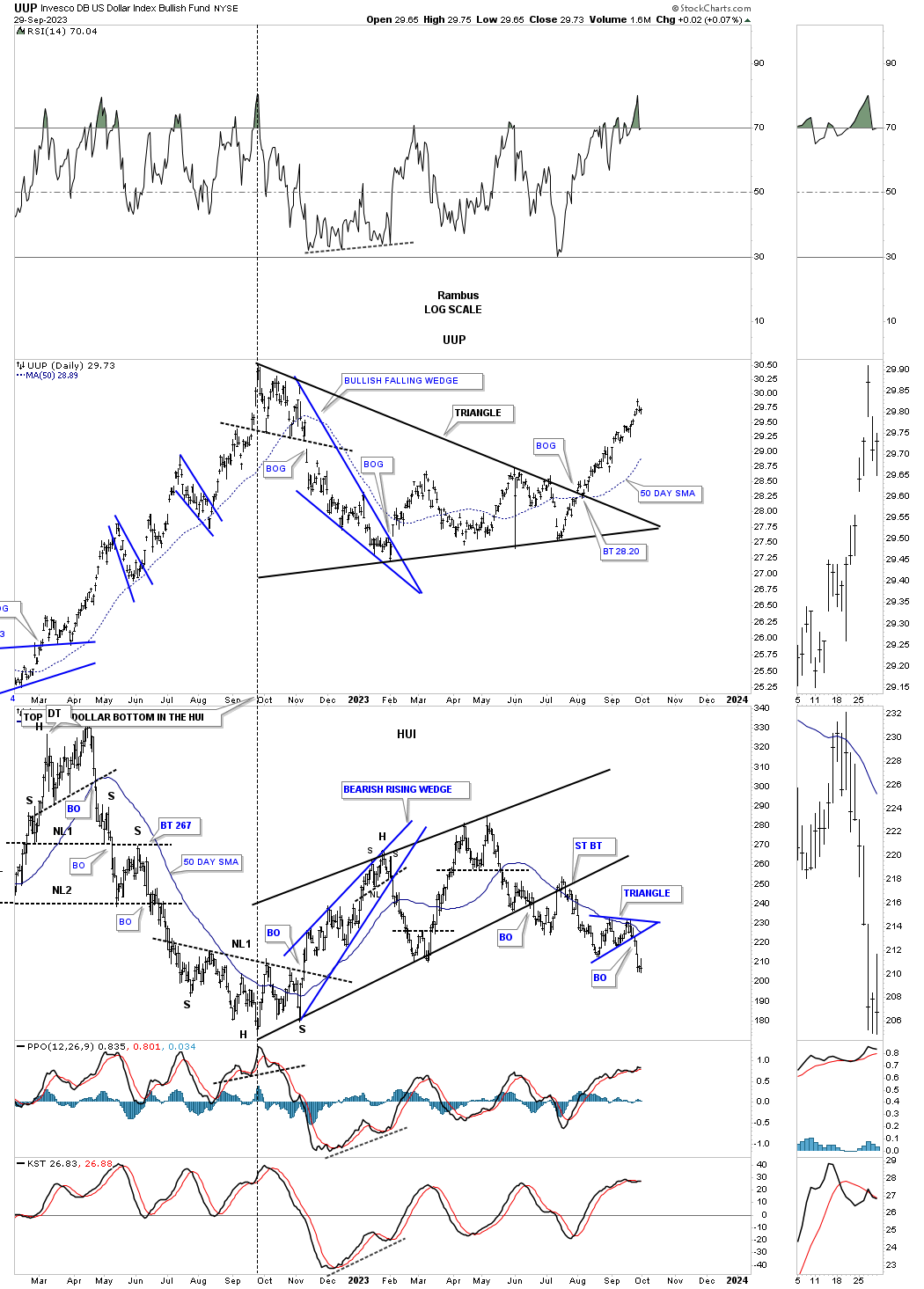
Before we look at some of the longer term charts I would like to start with a few much shorter term charts for the UUP, we’ve been following very closely, to bring you up to speed.
This first chart is the 2 hour chart for the UUP you should be familiar with which shows the 5 point triangle reversal pattern. If you recall back in July, at the 5th reversal point low, I mentioned many times how critical that low would be because if the bottom rail gave way to the downside we would see a 4 point consolidation pattern to the downslide. On the other hand I also mentioned that if the bottom rail held support we could see a 5 point triangle reversal pattern to the upside reversing the previous decline. As you can see the 5th reversal point did indeed hold support completing the 5 point triangle reversal pattern.
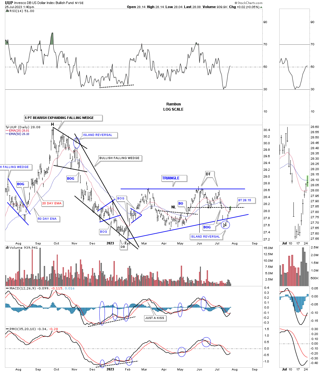
Below is what the daily chart looked like back on July 25th. In that report I mentioned that the island reversal pattern, at the last reversal point, could be a short term reversal or a large term reversal pattern. I also mentioned the Island reversal pattern made back at the last reversal point made at the November 2022 high, led to the strong correction and the beginning of the 5 point triangle reversal pattern.
This is what I wrote on July 25th:
Similar to the TNX chart above the UUP has formed the 2023 blue triangle which also shows a false breakout below the bottom trendline. I mentioned that the bottom of the double top would be the first area of resistance if the triangle was going to be a consolidation pattern. The double top trendline is now being tested after the small island reversal pattern formed below the bottom trendline. An island reversal pattern usually means a small countertrend reversal, but in some cases it can lead to the exhaustion of a big move, see the November 2022 island reversal.
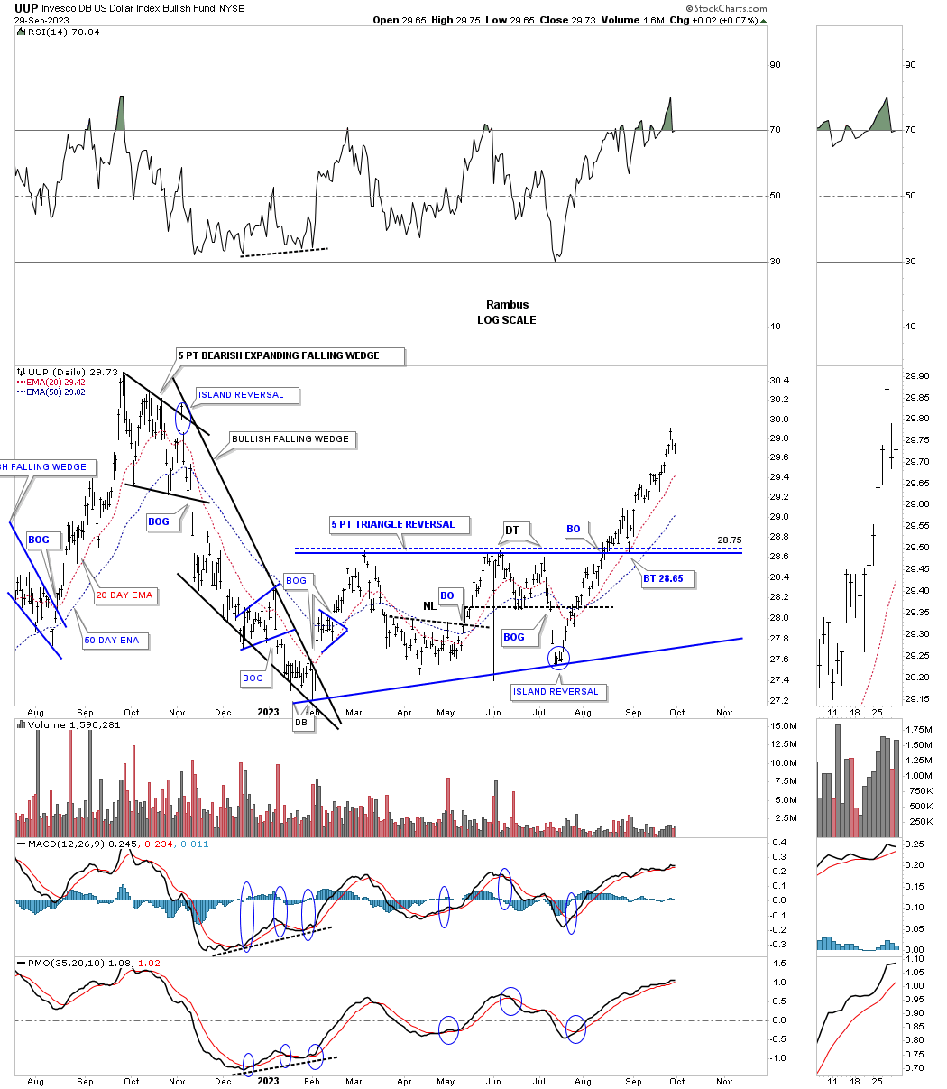
Today October 1st:
This is the exact same chart as the one above, but I tweaked the bottom trendline of the 5 point triangle reversal pattern to the spike low which shows the island reversal pattern now forming on top of the bottom trendline.
Shortly after the 5 point triangle reversal pattern completed I drew a new top trendline connecting the September 2022 high to the 4th reversal point high in the smaller 2 hour five point triangle reversal pattern which then shows a larger triangle consolidation pattern to the upside. So the base of the bigger triangle consolidation pattern is the 5 point triangle reversal pattern.
Below is the combo chart which has the UUP on top with the HUI below that we’ve been following for many years. During the formation of the triangle consolidation pattern the HUI was forming its own consolidation pattern which was the October 2022 bearish rising wedge. As you can see the inverse correlation isn’t perfect, but it is the important reversal points which are important to understand.
Lets move on to the actual US dollar which is slightly different from the UUP by looking at a daily chart which shows a 5 point bullish falling wedge reversal pattern instead of a triangle reversal pattern the UUP is showing. This chart also show the 2021 inverse H&S bottom which led to the last impulse move higher. Note how the neckline symmetry line showed where to look for a possible right shoulder low. The other bullish aspect of the H&S bottom was how the right shoulder formed the blue expanding triangle just below the neckline with the blue bullish falling wedge forming just above the neckline as the backtest. I often mention how bullish this type of setup can be when you see one consolidation pattern form below the neckline and one above.
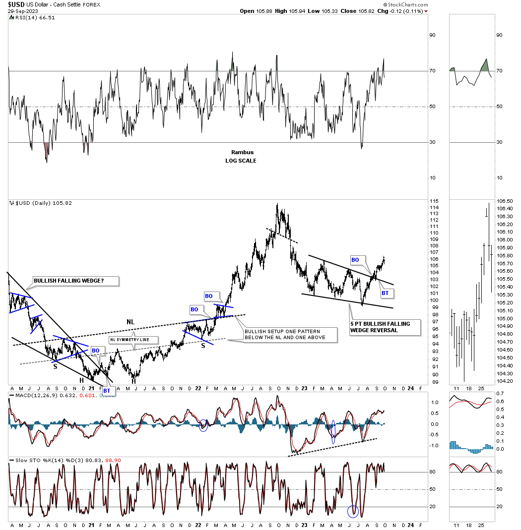
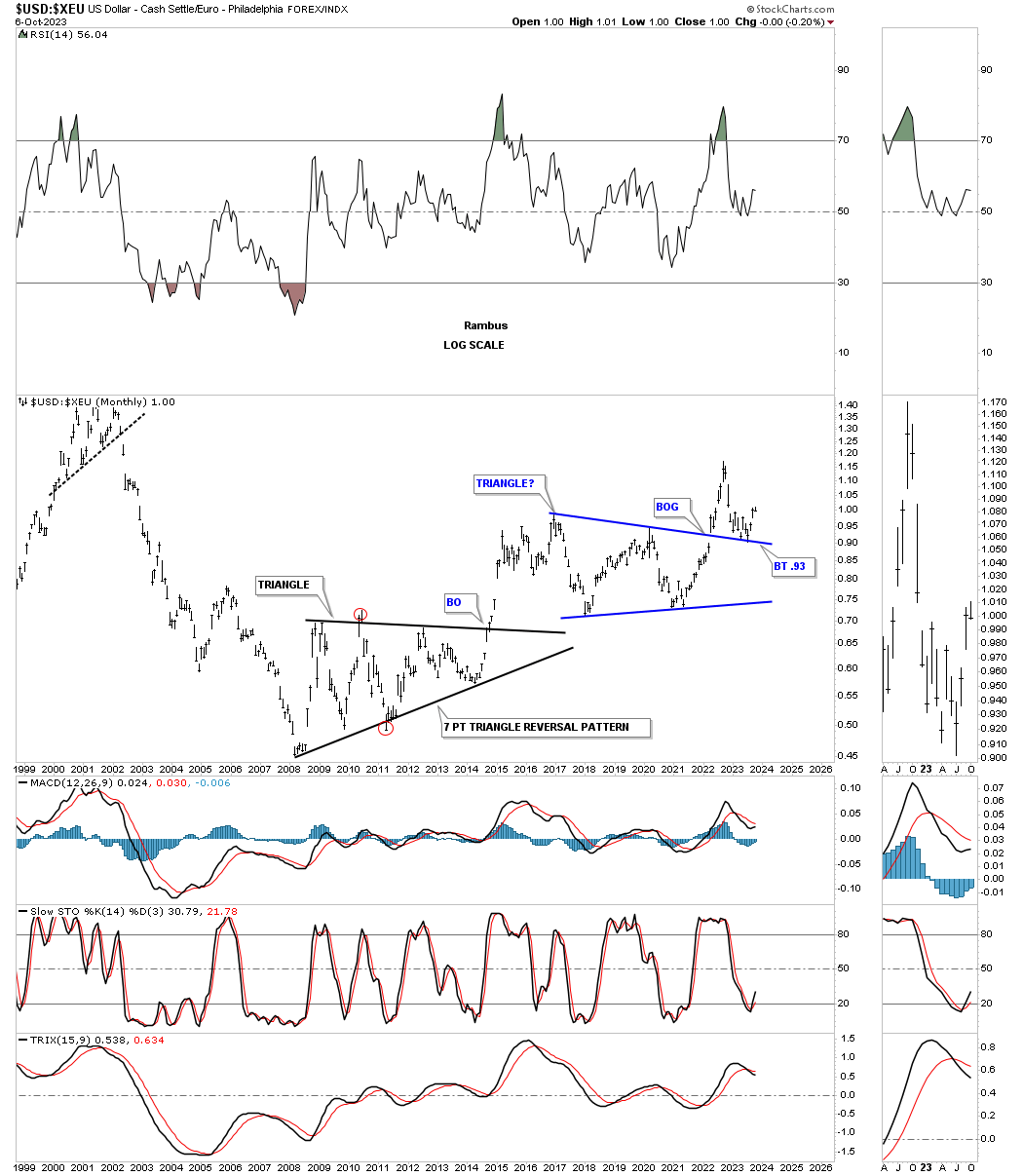
This next chart for the US dollar is a weekly look which is the basis for this, Weekend Report. This chart just focuses on the 2015 sideways trading range or rectangle. The initial high for the major impulse move out of the 2014 low stoped in early 2015 where you can see a pretty symmetrical rectangle consolidation pattern forming. It looked like all systems go when the price action broke out above the top rail of the small blue rectangle, but as you can see the impulse move failed quickly showing a false breakout.
Once back inside of the original small blue rectangle the US dollar made a complete reversal point to the downside bouncing off the bottom rail of the small rectangle, and bounced with little vigor, and then dropped below the bottom rail which showed another false breakout. This is what I call a symmetry failure of the top and bottom rails of a morphing rectangle which can also happen with triangles, blue circles. Normally the direction of the initial false breakout, in this case to the upside, suggests that when the pattern completes, the breakout will be to the upside.
The rally out of the 2021 low, reversal point #4, was very strong breaking out above the very large 2015 rectangle consolidation pattern. After the rally was exhausted came the hard decline to backtest the top of the rectangle consolidation pattern. What can happen when you see a backtest to a rectangle is that the backtest, if the top rail doesn’t hold support, many times the center dashed midline will be the very last reversal point before the real impulse move begins.
In this case I used the top rail of the small blue rectangle as the next area of support if the top rail didn’t hold. As you can see the 5 point bullish falling wedge, that we just looked at on the weekly chart above, formed the backtest which was a little deeper than the top trendline, but still in line with the Chartology.
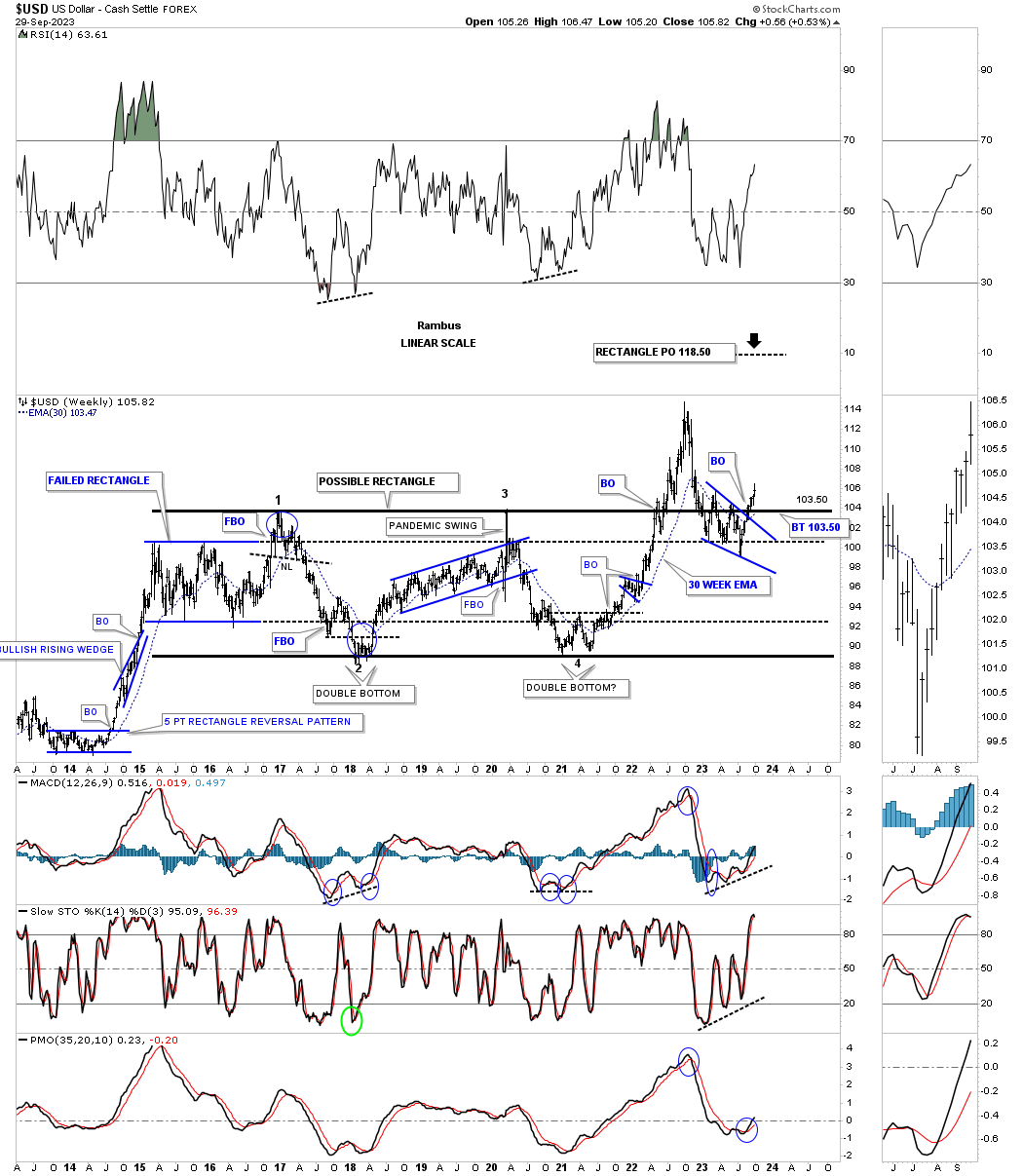
Moving on to a monthly chart which I first built out in 2014, shows the point where I had an epiphany moment when I recognized the massive 11 year base and what it could mean for the US dollar. As you can see it was several months before the actual breakout of the 11 year base. Note all the white monthly candlesticks that formed that massive impulse move. From that initial high, small blue rectangle, began the construction of the current eight year rectangle consolidation pattern which has already experienced the breakout and the strong backtest that looks like it is completing .
When I had that epiphany moment in 2014 it wasn’t only the 11 year base that I saw, but I also realized it was a fractal to the previous 11 year base that formed in the 1990’s. When looking at the 11 year base made back in the 1990’s you can see the bull market was much steeper than the our current bull market uptrend channel. During the bull market rally out of big base #1, you can see the beautiful blue bullish rising wedge consolidation pattern that formed a halfway pattern. The top of that rally ended in 2000 just when the PM complex was bottoming. The 2011 bear market low in the US dollar marked the end of the PM complex bull market.
Looking at our current bull market uptrend channel that began in 2011 the massive rectangle looks like it will be a halfway pattern to the upside at a minimum. At this point in time the secondary support line, top rail of the small blue rectangle, is going to be my line in the sand. If the US dollar can’t hold support over the current backtest low then I will have to go back to the drawing board, but for now the Chartology looks great for another impulse move higher which is just getting started.
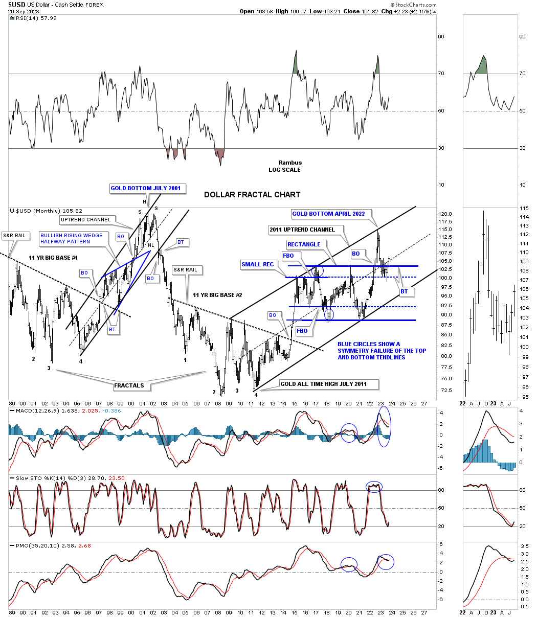
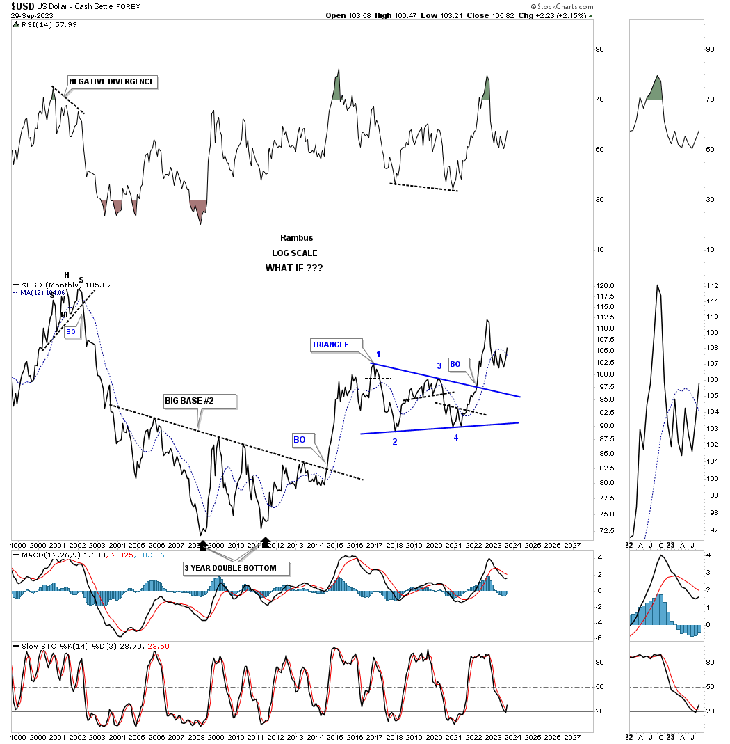
This next chart is a monthly line chart which shows the 11 year big base #2 and the initial impulse move up. Since the high at reversal point #1 the US dollar has been consolidating forming the triangle consolidation pattern with a strong initial breakout move. The tight little chopping action at the recent low is the 5 point bullish falling wedge reversal pattern on the weekly chart above.
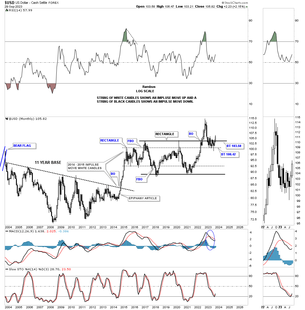
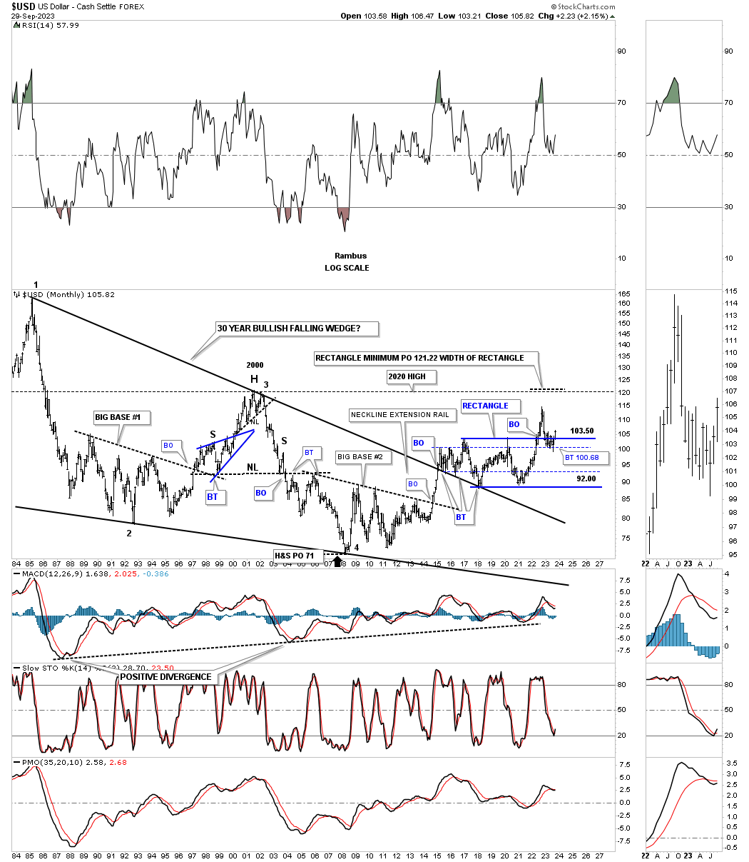
This next long term monthly chart shows the US dollar’s all time high made back in 1986 and the bear market that followed. This chart also shows big base #1 and big base #2 which has made up the biggest part of the bullish falling wedge. The initial high out of big base #2 took the US dollar above the top rail of the 20 year bullish falling wedge. Note the three backtests from above with the last one being the beginning the 2nd reversal point in the 8 year blue rectangle consolidation pattern. A conservative price objective for the blue rectangle is taken by measuring the width and adding that distance to the breakout point which puts the price objective up to the 2000 high.
This first quarterly history chart is a combo chart with the US dollar on top and Gold on the bottom. This very long term history chart shows the important reversal points between the two. If the US dollar is in the process of breaking out from its 8 year rectangle consolidation pattern then there is a good chance that Gold could decline down to the bottom of its 2020 flat top expanding triangle. We already know that Gold has recently broken down from a H&S top at the recent high.
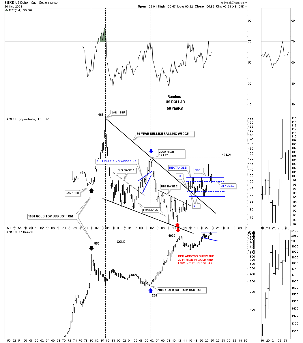
This next long term monthly chart shows why I believe the US dollar is beginning the next impulse move higher and why Gold could be moving lower. As you know I show many charts with the brown shaded support and resistance zones which are just that, zones. Note the lower brown shaded S&R zone on the US dollar which held support on the breakout from big base #2. The upper brown shaded S&R zone shows the breakout from the 8 year rectangle consolidation pattern and the the backtest to the S&R zone.
When looking at Gold below I’m showing a possible rising wedge with the 2020 expanding triangle forming at the last reversal point. If the US dollar reaches its previous high made back in 2000 when the PM complex was bottoming, then Gold could reach a low where the bottom rail of the 2011 rising wedge and the bottom rail of the blue expanding triangle intersect around the 1550 area. This would keep Gold in its secular bull market that began in 2000 if we find an important reversal pattern at the possible low around the 1550 area.
In Part 2 we’ll be looking at some of the more important currencies of the world and how their long term charts relate to the US dollar. All the best…Rambus
In last weeks, Weekend Report Part 1, we looked at the US dollar from the intermediate to the long term perspective to try and understand what may lie ahead for the worlds reserver currency since the end of World War 2.
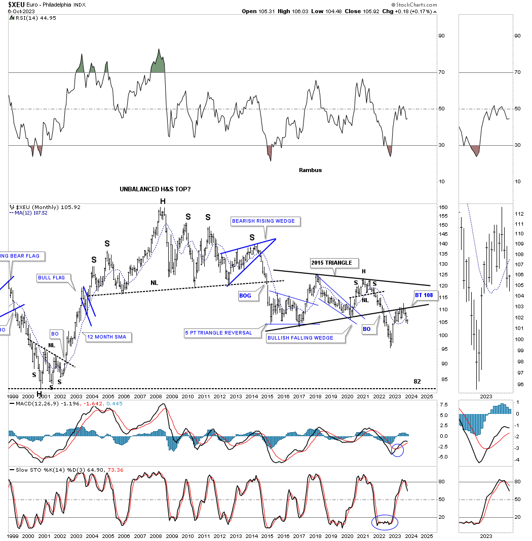
In part 2 we’ll look at some of the more important currencies of the world that make up the US dollar and what they may be suggesting based on their weighting. The higher the weighting the more the individual currencies will have an inverse correlation. Lets start with the XEU which has the biggest weighting of 57%.
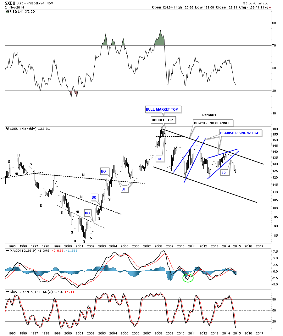
Back in November of 2014 I did a report on currencies starting off with this long term monthly chart for the XEU which will show the biggest inverse correlation. There were two dominate chart patterns that were presenting themselves, the 2008 downtrend channel and a very large H&S top. Lets look at the 2008 downtrend channel first and what I wrote back in November of 2014 almost 9 years ago.
This is what I wrote on November 21st 2014:
This last chart for the euro is a long term monthly chart that shows the current downtrend channel that has been in place since 2008. You can see the last pattern on the chart is the big two year blue bearish rising wedge we looked at on the charts above. After all the consolidating is finished is when you get your impulse move. As you can see, the price action since the breakout of the blue bearish rising wedge, is in a near vertical move down. This is how markets function.
Today October 8th 2023:
Compare the 2014 bearish rising wedge on the chart above to this current chart which shows the exact same 2008 downtrend channel and how that bearish rising wedge played out. On the current monthly chart you can see the red bearish falling wedge that formed a halfway pattern to the downside.
Once that impulse move completed in 2015 / 2016 it was time for the XEU to either consolidate or build a reversal pattern of some kind. As it turned out the XEU traded sideways until the top rail of the 2008 downtrend channel was touched once again which completed the all important 4th reversal point in the 2016 blue triangle consolidation pattern. As you can see the bottom trendline was broken which completed the initial move down from the 4th reversal point high. Subsequently the XEU enjoyed a strong countertrend rally which was the backtest to the bottom trendline three months ago.
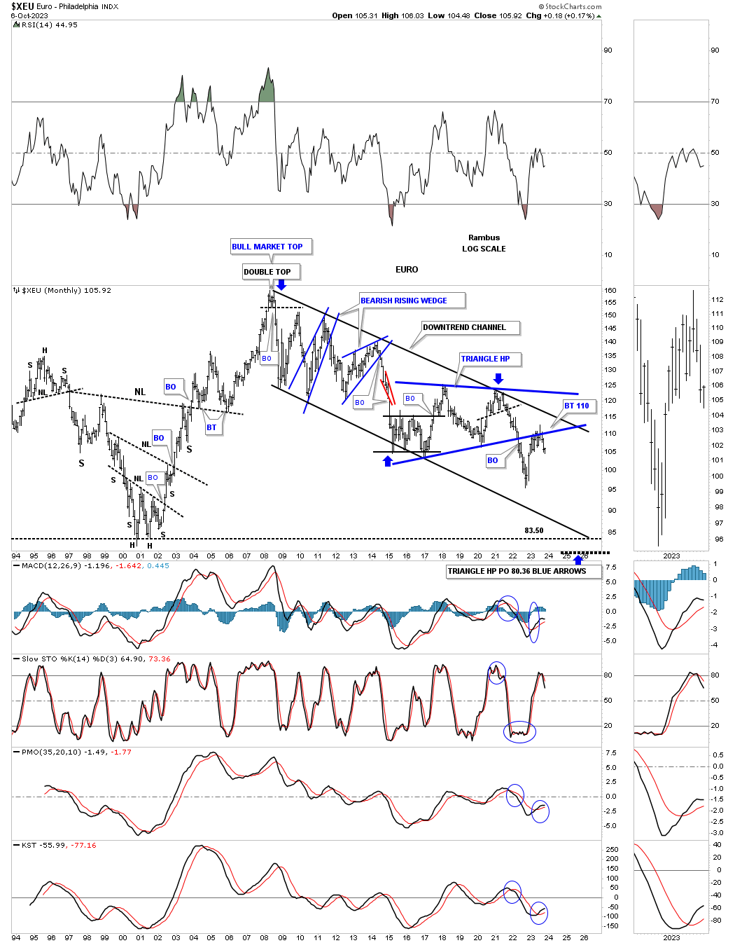
The other dominate chart pattern we’ve been following since the 2008 all time high is the massive H&S top. Again, note the blue bearish rising wedge and how it formed the right shoulder. You can also see the internal structure of the 2016 triangle consolidation pattern that was the backtest to the neckline.
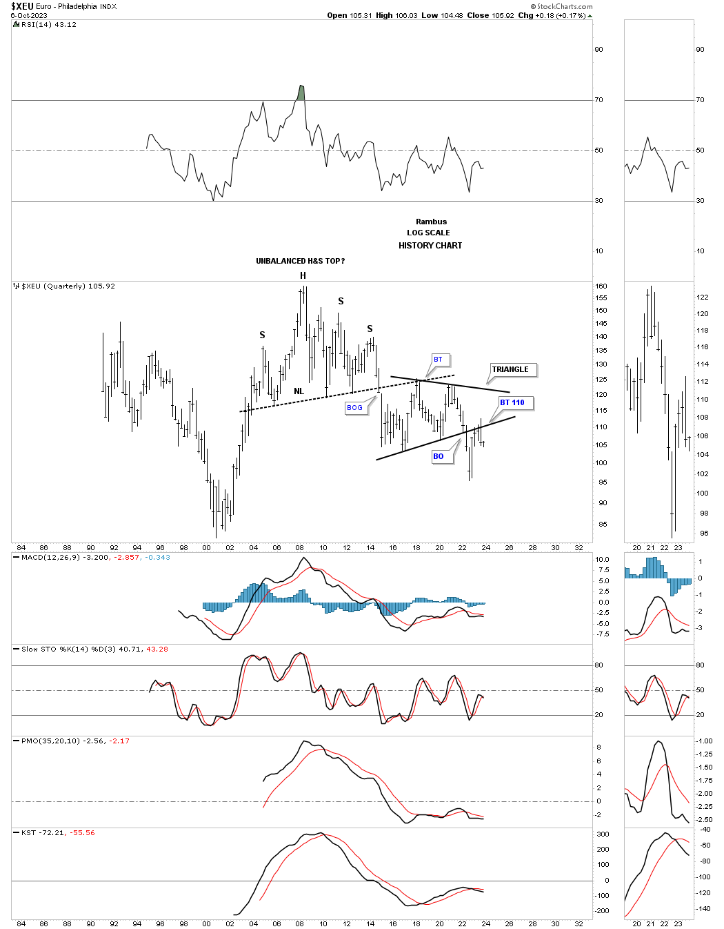
Below is the quarterly history chart which shows the massive H&S top and the blue triangle consolidation pattern with a backtest from below last quarter.
This next chart is a ratio chart which compares the US dollar to the XEU. When the price action is rising the US dollar is outperforming the XEU. Since the low in 2008 you can see the two big consolidation patterns. The lower triangle broke out in 2014 with no backtest while the blue triangle consolidation pattern is just completing a backtest.
Next is a weekly line combo chart with the XEU on top and the US dollar on the bottom. This chart shows you a good example of the inverse correlation these two generally have. Back in the summer they both broke out from their 5 point reversal patterns and have been in their respective impulse move. Keep in mind they both have moved in an almost vertical move so some consolidation should be expected which if the reverse symmetry plays out should be very small.
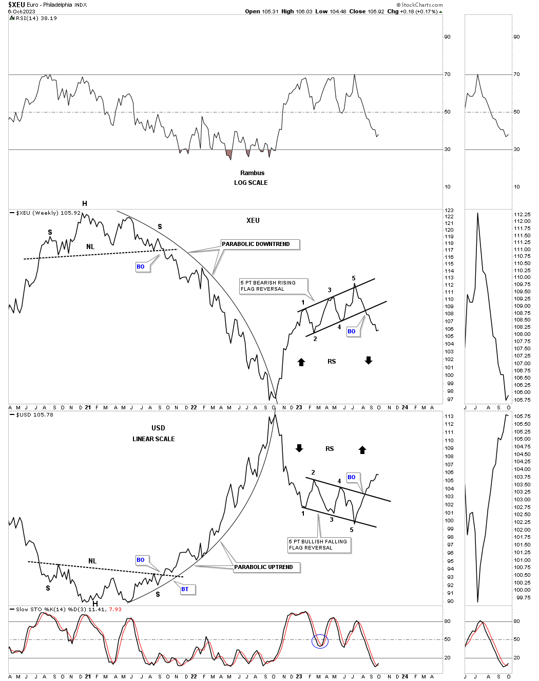
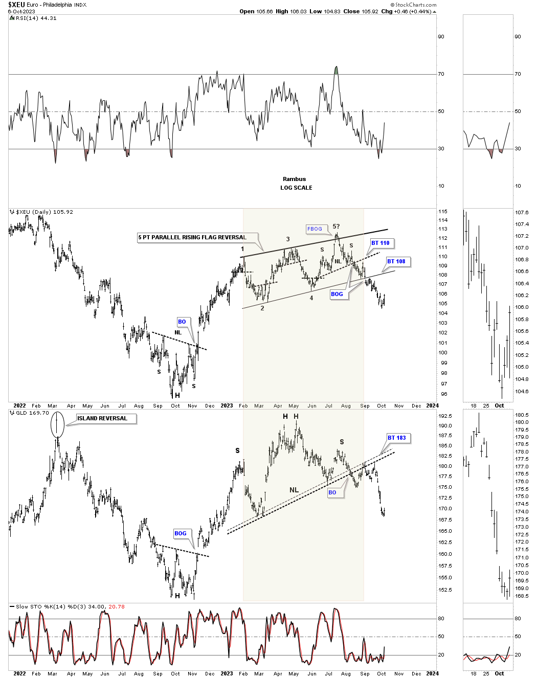
Next is another combo chart which has the XEU on top with GLD on the bottom. If the inverse correlation between the XEU / US dollar, weekly chart above is true, then the XEU and Gold should have a more positive correlation. Remember correlations are never perfect, but it is the important reversal points which are important to look for.
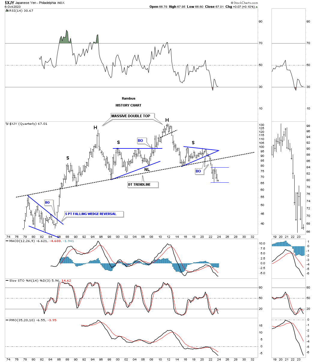
Next lets look at the XJY which only makes up 13% of the US dollar, but is important to look at nonetheless. This long term monthly chart shows the H&S top which ended the XJY’s bull market in 2011. From that all time high the price action has been declining forming the blue bearish falling wedge as a halfway pattern on the initial impulse move down. After bottoming in 2015 the XJY began to consolidate that massive move forming a large triangle consolidation pattern.
The breakout came in 2021 with another very strong impulse move lower with an initial low early this year followed by a countertrend rally up to the 2015 low which held resistance. Currently the price action is trading back down to the low made earlier this year which can be important for the short term. It is possible that some type of consolidation pattern may start to form which will need one more reversal point to the upside and then back down.
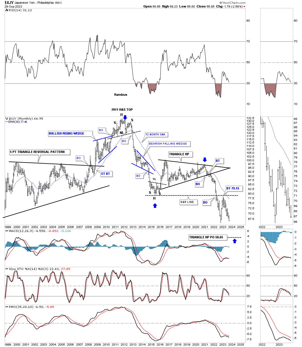
This history chart for the XJY shows a massive H&S top with the blue triangle being the same one on the chart above. You can also see the possible smaller blue trading range forming below the neckline which needs one more reversal point to the upside to form a possible consolidation pattern to the downside.
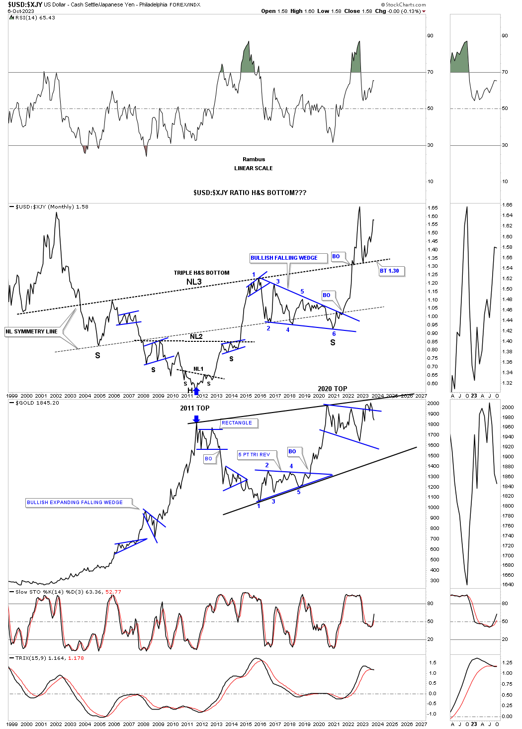
This next long term monthly line ratio chart comparing the US dollar to the XJY shows a massive inverse H&S bottom which I also built back in 2014 / 2015. At the time the right shoulder was just beginning to form with the neckline symmetry line showing a place to look for a possible right shoulder low. I had no idea of what type of consolidation pattern may form the right shoulder, but it turned out to be a 6 point bullish falling wedge. Note the massive breakout move from the 6 point bullish falling wedge which also had enough strength to finally take out the neckline with a nice clean backtest.
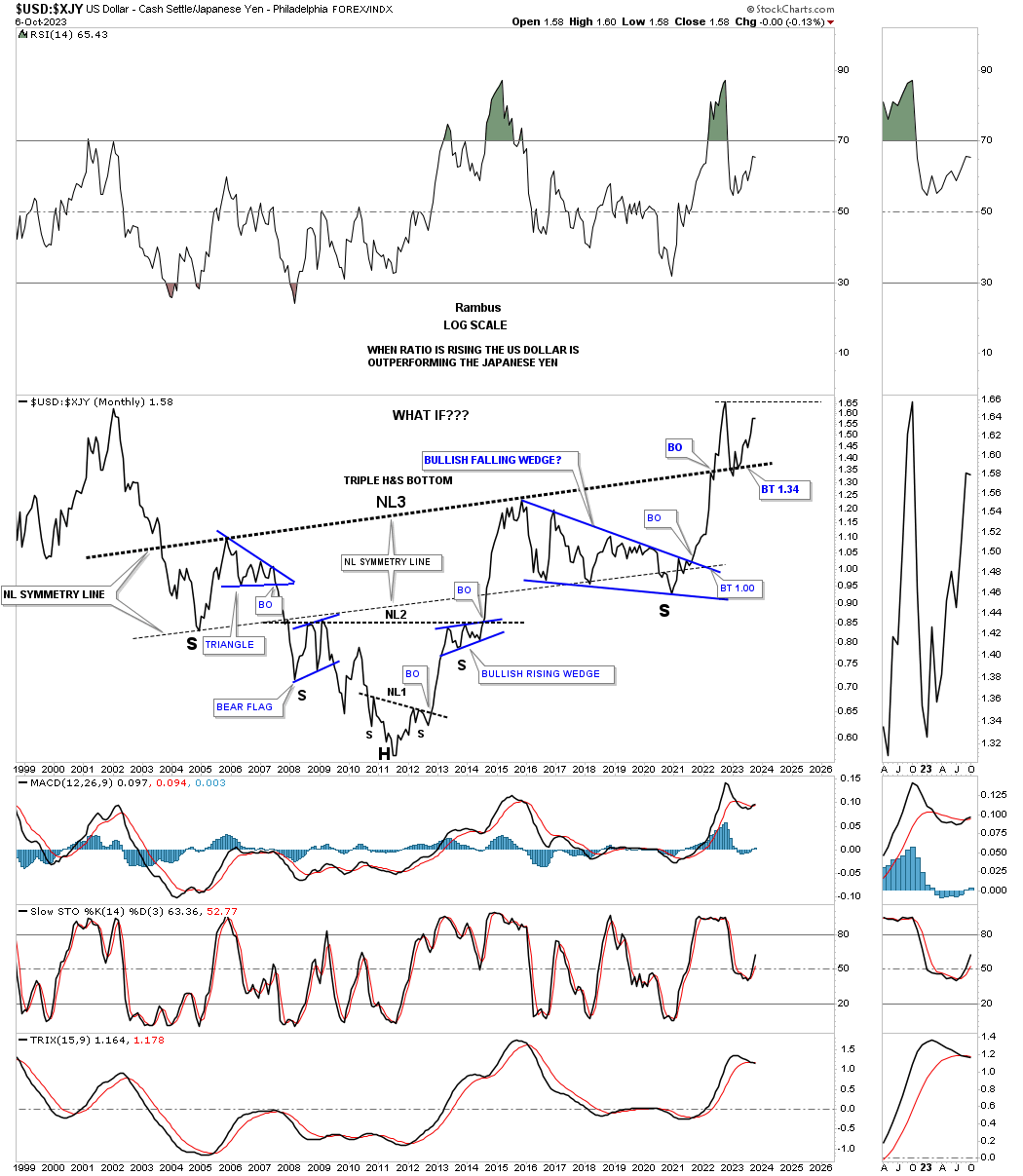
Below is the exact same ratio chart as the one above, but I’ve added Gold to the bottom panel. The correlation between the US dollar:XJY and Gold in not perfect by any stretch of the imagination, but many of the critical reversal points are very similar. For instance, you can see the 2011 bottom in the ratio and the 2011 high in Gold. There is also the 2020 low in the ratio and high for Gold.
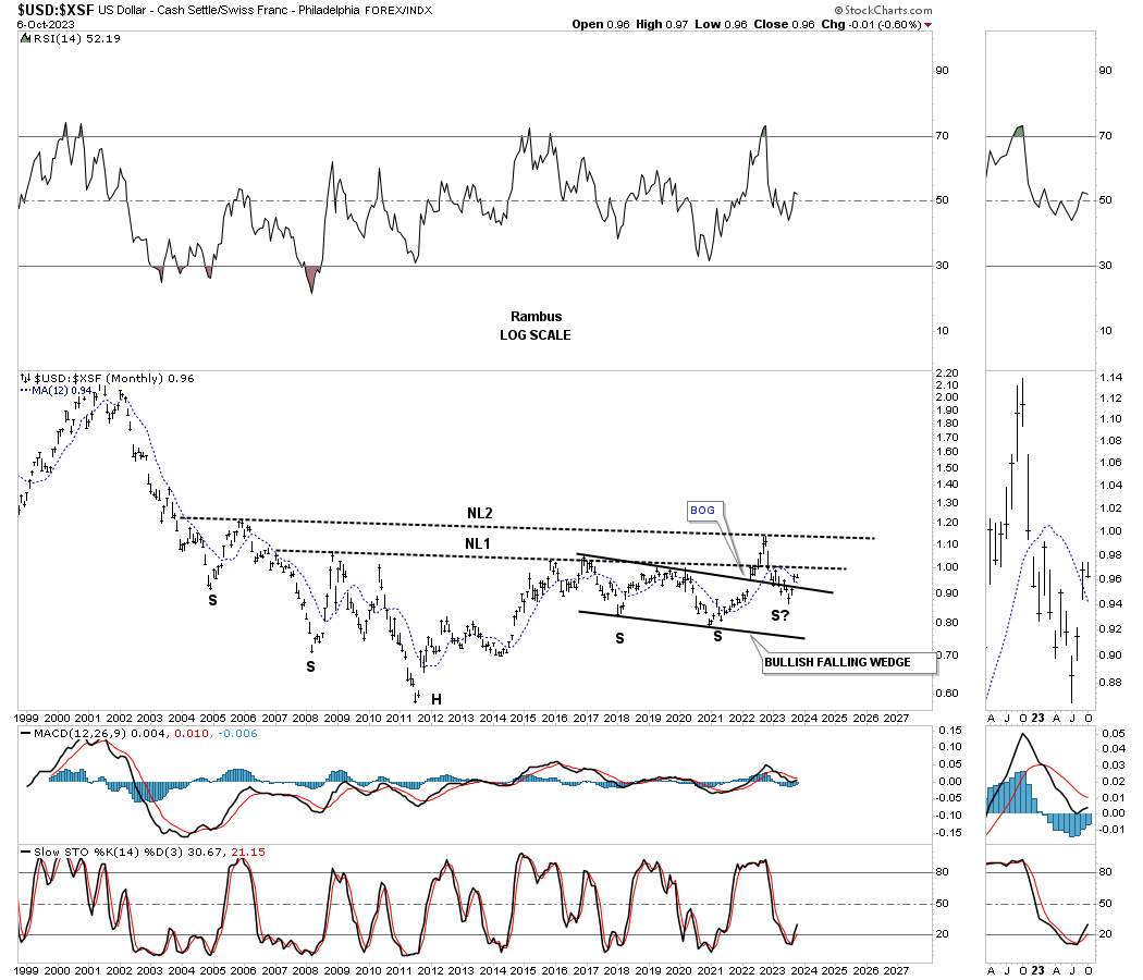
One of the better looking currencies is the XSF, Swiss franc, which has been building a rectangle trading range since 2015 and just recently tested the top trendline and now has declined back down to a secondary support line.
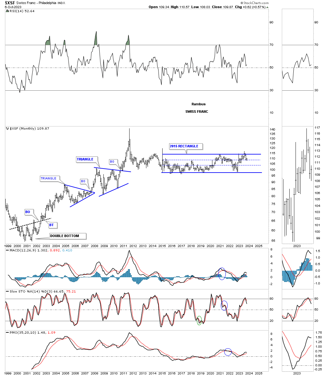
When we compare the US dollar to the XSF it too is forming a possible massive double H&S base where neckline 1 gave way last year with a strong backtest three months ago. Note the breakout gap above the right shoulder bullish falling wedge with another gap above the top rail last month. This is suggesting the backtest may have been competed.
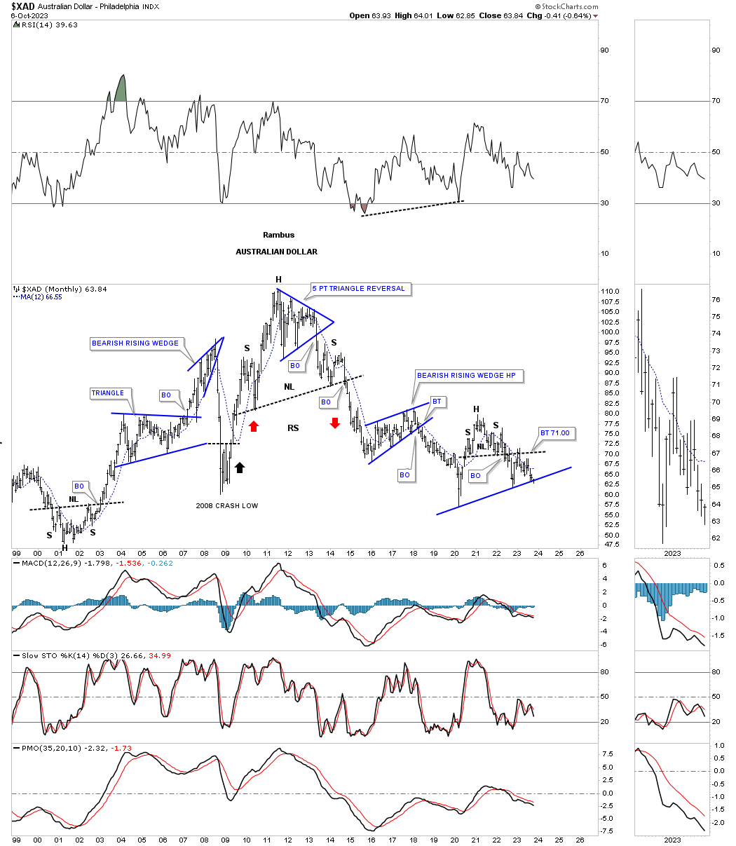
Next is the XAD, Australian Dollar, showing a triangle reversal pattern at the 2011 high which ended up being part of a much bigger H&S top. After putting in a H&S top in 2021 and 2022 the price action has completed a backtest to the neckline and is now testing possible support on the bottom blue trendline which I view as a support and resistance line currently. Above is bullish and below is bearish.
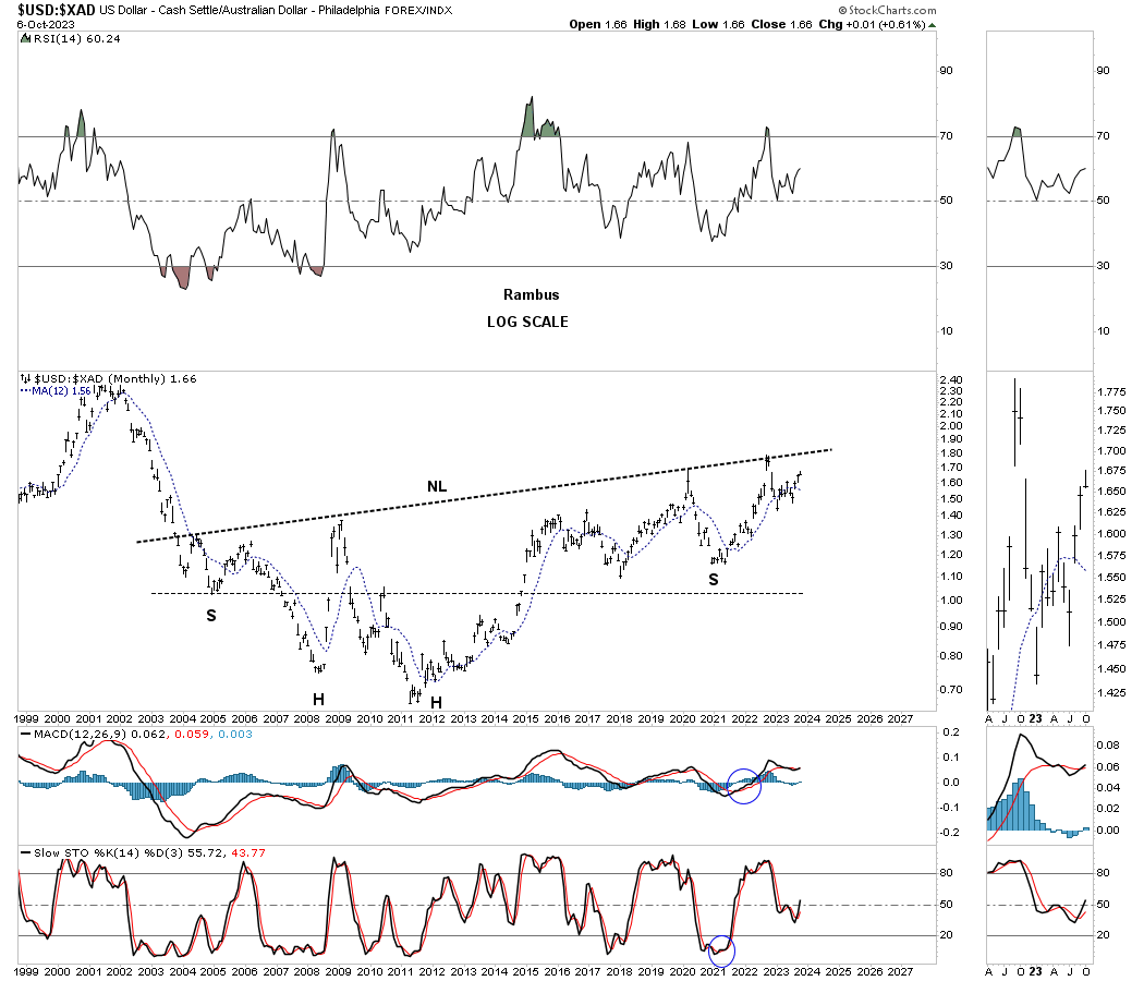
Next is the ratio chart comparing the US dollar to the XAD. Similar to the other currencies ratio charts, comparing the US dollar, this ratio chart is also showing a possible very large unbalanced H&S bottom. Most of the time when I’m looking for a right shoulder low I will use the neckline symmetry line. If that isn’t working I will draw a horizontal line from the left shoulder to look for a right shoulder low as shown on this chart.
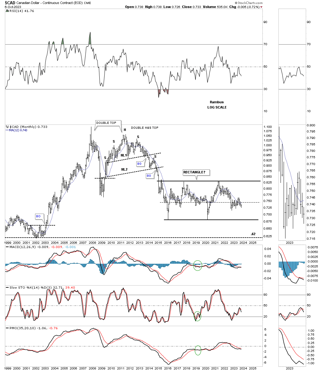
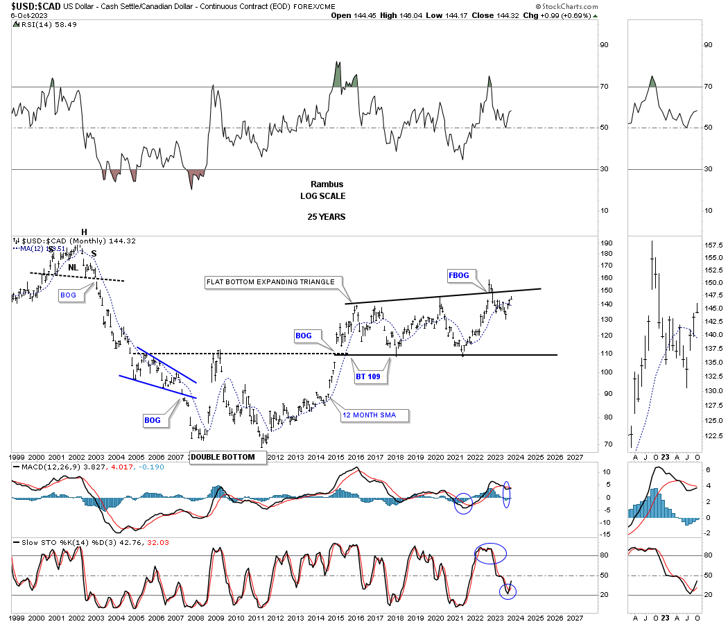
Next is the long term monthly chart for the CAD, Canadian Dollar, which shows its massive topping patterns at its all time high. There are two massive topping patterns, the double top and the double H&S top. Since completing its impulse move in 2016 the price action has been carving out a very large and potential rectangle consolidation pattern.
When we compare the US dollar to the CAD, the reversal pattern was a well defined double bottom. After a breakout gap above the double bottom trendline the ratio has been building out a flat bottom expanding triangle using the double bottom trendline as support. After the initial failed breakout above the top trendline the ratio moved back into the pattern negating the breakout for now. A rally back above the top trendline would then be very bullish for the ratio.
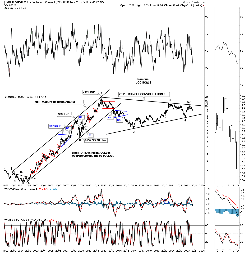
This next chart compares Gold to the US dollar. When the ratio is rising Gold is outperforming the US dollar. Since the all time high for the ratio made in 2011 the price action has been trading sideways consolidating that massive bull market rally. One of the most bullish setups I could see for Gold is for the ratio to trade down to the bottom rail of the 2011 triangle, which has completed four reversal points so far and is working on its 5th, and if the bottom rail can hold support that would create the 6th reversal point. Believe it or not, timewise the 2011 triangle has taken more time to buildout than the 11 year bull market rally out of the 2000 bear market low.
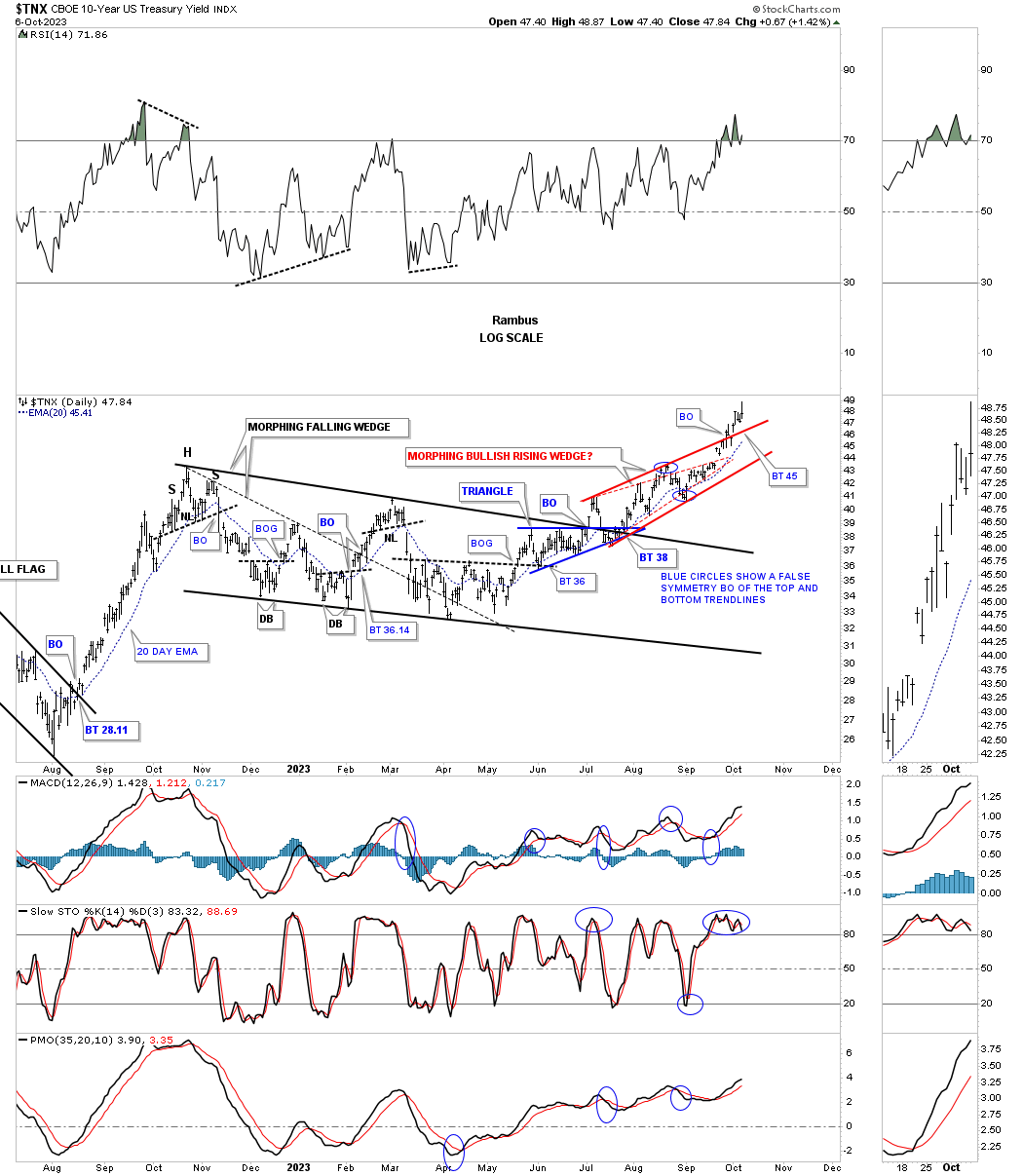
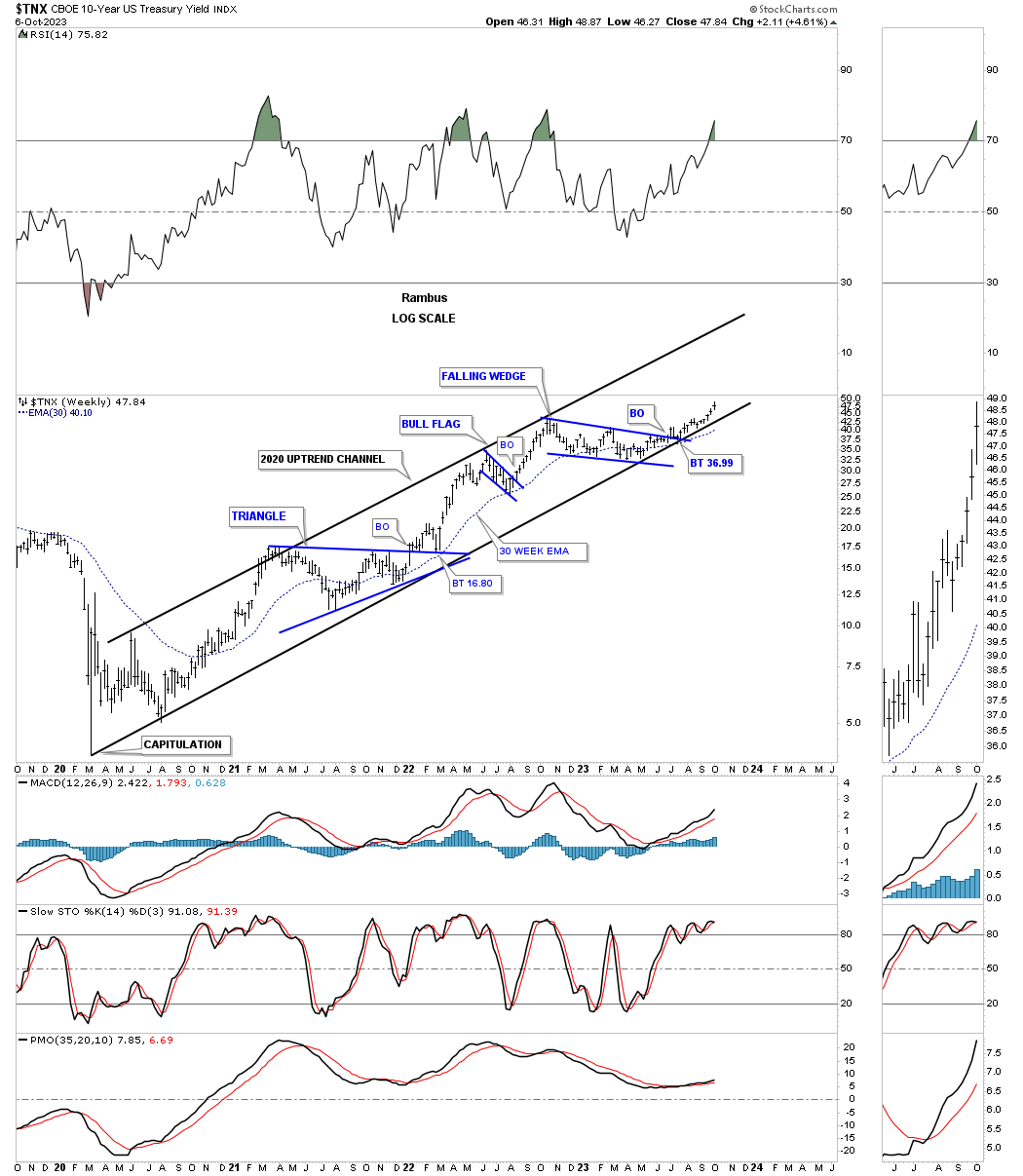
Since I have a little more time tonight I’m going to add some charts for the TNX, 10 year bond yield, starting with this daily chart we’ve been following since the beginning of its existence at the October 2022 high. Initially you can see the much smaller falling wedge where the breakout move failed to take out the October 2022 high. That was a clear indication that the falling wedge would more than likely morph into a bigger falling wedge.
This past summer you can see the small blue triangle that formed just below the top rail of the October 2022 falling wedge which was suggesting the top tendline would most likely give way. After a strong backtest the TNX began to move higher forming an initial small red rising wedge, thin red dashed trendlines, which has morphed into the bigger red rising wedge with a new multi year new high made last Friday.
Going back further in time below is a weekly line chart showing what the bullish falling wedge, on the chart above, looks like from this perspective. Before we move on take note of the 3 year inverse H&S bottom which is most critical to the long term charts to follow.
Next is a bar chart showing the inverse H&S bottom and the bullish falling wedge we looked at on the daily chart above. When the price action reached to the 2018 high I drew a horizontal line to the right side of the chart to see how the price action would interact with it. As you can see it was classic. Note the small bullish falling wedge that formed just below it and then the October 2022 bullish falling wedge which formed on top of it which is usually a very bullish setup.
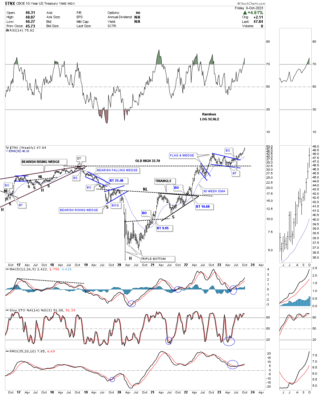
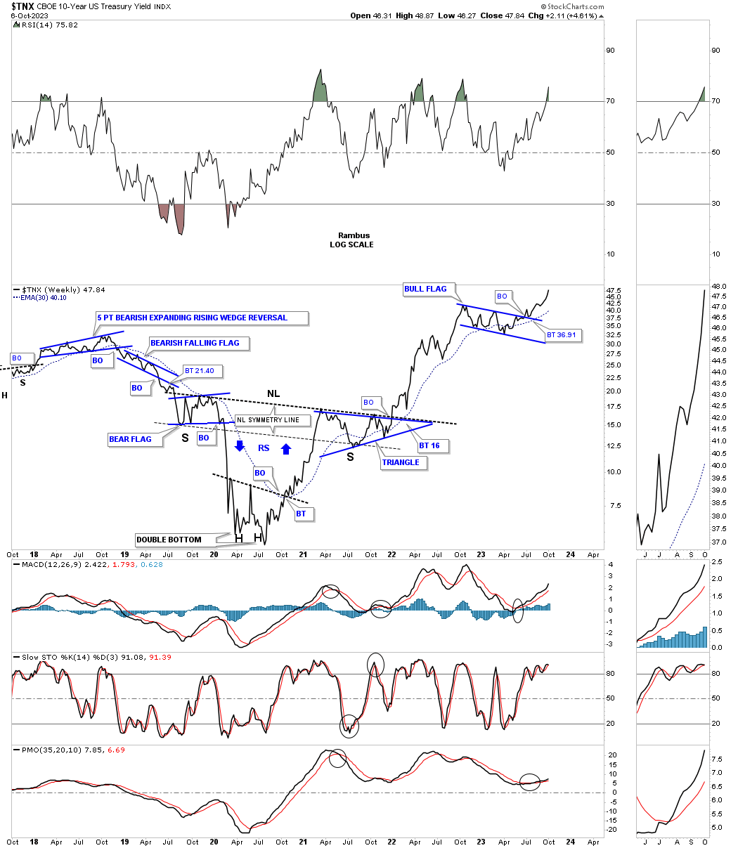
Since the 2020 crash low in interest rates the TNX has been moving higher in a well defined parallel uptrend channel. Note how the price action has been walking up the bottom trendline after breaking out from the 2022 bullish falling wedge.
This next chart shows the bear market in interest rates, using the TNX, starting at the H&S top made all the way back to 1981. What follows are all the consolidation patterns that formed that massive bear market. Now you can see how the inverse H&S bottom, on the weekly line chart above, fits into the very big picture. There was a large H&S top made in 1981 that started the bear market and then there was the 2020 inverse H&S bottom that ended the bear market and breathed life into the new bull market which is now 2 1/2 years old.
Note the breakout above the top rail of the blue rectangle and the backtest from above. That backtest is the bullish falling wedge we looked at on the first daily chart for the TNX above.
It was a fitting end to the low in interest rates as shown by the capitulation spike low made in 2020 which ended up being the head for the inverse H&S bottom. That is also what a V bottom looks like.
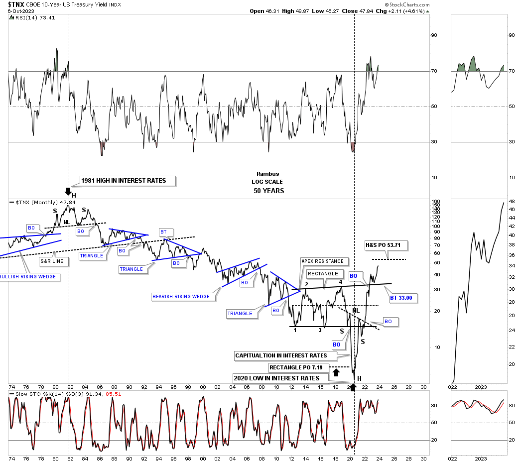
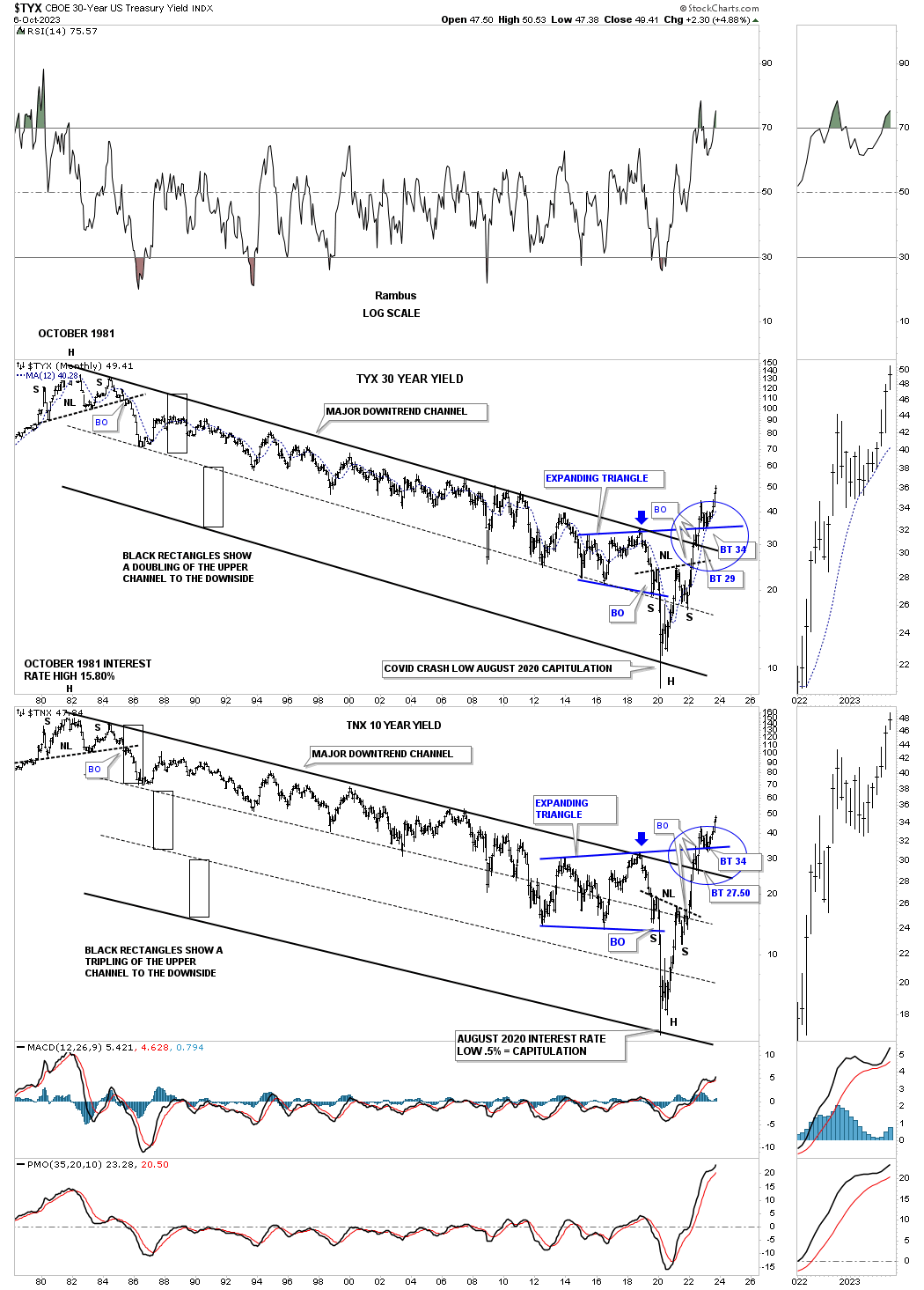
This last chart for tonight is a combo chart with the TNX on top and the TYX, 30 year bond yield, on the bottom. This chart shows you how an uptrend or downtrend in this case, can double or even triple in a symmetrical way. Note how nice and tight the top downtrend channel on the TNX was until the capitulation move into the 2020 crash low. Whenever you see a well defined channel like that breakout to the downside there is a strong possibility that the original channel will double in size where you can then look for the next possible low, as shown by the black rectangles that are exactly the same height.
In the case of the TYX you can see how the top channel broke down in two more equal channels showing the capitulation low in 2020,
Between last weeks long term look at the US dollar and this weeks look at some of the currencies that make up the US dollar, the long term bull market for the US dollar remains intact. That also applies to the TNX and interest rates in general. What the US dollar does tomorrow or next week you can make your own decision. What the US dollar is showing us in the long term is the bull market remains in place until something changes it. The trend is your friend until it isn’t. All the best…Rambus
Related Reading:
- Rambus: Blockbuster Chartology – August, 2023
- Rambus: Blockbuster Chartology – May, 2023
- Rambus: Blockbuster Chartology – January, 2023
- Rambus: Blockbuster Chartology – October, 2022
- Rambus: Blockbuster Chartology – July, 2022
- Rambus: Blockbuster Chartology – May, 2022
- Rambus: Blockbuster Chartology – February, 2022
- Rambus: Blockbuster Chartology – October, 2021
- Rambus: Blockbuster Chartology – July, 2021
- Rambus: Blockbuster Chartology – April, 2021
- Rambus: Blockbuster Chartology – January, 2021
- Rambus: Blockbuster Chartology – October, 2020
- Rambus: Blockbuster Chartology – July, 2020
- Rambus: Blockbuster Chartology – May, 2020
- Rambus: Blockbuster Chartology – January, 2020
- Rambus: Blockbuster Chartology – October, 2019
- Rambus: Blockbuster Chartology – July, 2019
- Rambus: Blockbuster Chartology – April, 2019
- Rambus: Blockbuster Chartology – January, 2019
- Rambus: Blockbuster Chartology – October, 2018
- Rambus: Blockbuster Chartology – July, 2018
- Rambus: Blockbuster Chartology – April, 2018
- 2017 Annual Wrap Up – Does Your Pension Fund Have A Deep State Drain? – January, 2018
- 1st Quarter Wrap Up 2018 Web Presentation
- Blockbuster Chartology with Rambus – October, 2017
- Blockbuster Chartology with Rambus – July, 2017
- Blockbuster Chartology with Rambus – May, 2017
- Blockbuster Chartology with Rambus – January, 2017
- Blockbuster Chartology with Rambus – October 20, 2016
- Blockbuster Chartology with Rambus – July 21, 2016
- Blockbuster Chartology with Rambus – April 21, 2016
- Rambus: Are We in a Deflationary Spiral? – January 28, 2016
- The Dollar, Gold & the S&P 500 with Rambus – October 15, 2015